The new and more engaging personality test
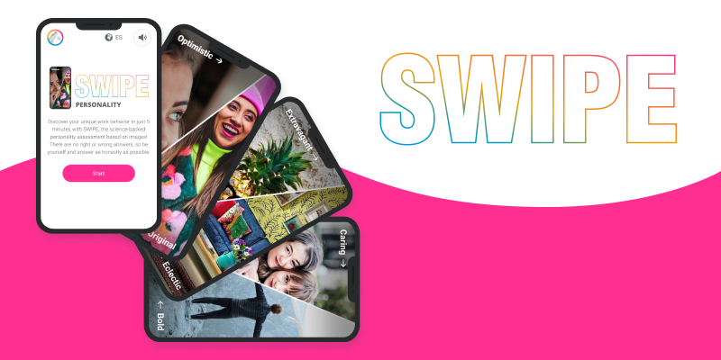
Year: 2022-2023
My role: UX/UI designer
Company: Internal project with AssessFirst, a solution that offers a complete assessment of soft skills and potential, built on 3 key factors: personality, motivation and cognitive style.
Team: In addition to working closely with the product manager and the assigned front-end developer, there was significant teamwork with the head of science in the conception of the product.
The AssessFirst social skills assessment is based on 3 tests, one of them a personality test called SHAPE. According to the feedback and satisfaction of customers and users, and the completion and spontaneity data, this test had some problems:
It was so long that users lost interest and attention, sometimes even abandoning the test.
After reading several questions, users get tired and bored of reading and lose concentration, making their answers less reliable.
The test had accessibility issues in both the code and the UI design.
The visual design was flat and far from current trends.
The solution to these problems was to redesign the test with the science team to create a shorter and more attractive test.
Old Shape personality test preview.
1. Conception: Teamwork with the head of science to define the needs and iterations of the project.
2. Product definition : Definition of the specifications and user journey of the test version.
3. Test version : Screen design for the test version.
4. Test conclusions : Analysis of user tests and review of the specifications and the user journey.
5. Final solution : Wireframing and prototyping for the final version.
During the conception phase I met with the head of science and the head of product to determine the needs of the new test.
From a UX/UI perspective, the test needed to be:
5 mins. average completion time
More visual answers
More attractive thanks to gamification and more interesting interactions.
Mobile would be the most used device although it also had to be accessible from desktop.
From the science perspective, the test had to:
Reuse the structure of the previous test to be able to paint the same results.
Insights about the candidates regarding the 20 AF personality dimensions
The test needs enough questions to still ensure its reliability
Before launching the new test, the science team would need to validate the reliability of its results. Therefore, a test version would first be developed to check the accuracy of the questions. This version would also allow us to test the usability of the solution and user satisfaction. This previous study had certain particular requirements:
Users needed to have passed the old test so that the science team can compare the results.
Several series of questions would need to be tested to find the ones that give the right insights.
Once all the needs have been clarified, we defined the test version specifications:
To collect data about users regarding the 20 AF personality dimensions
Questions, or items, would be pairs of concepts represented with images to choose between
A button would be added in case the user cannot choose between the 2 options.
A tutorial and a trial would introduce the test.
After the test, questions about user satisfaction would be asked.
We also brainstormed the type of interactions we could include in the test. We wanted the test to be more attractive, so the main action, choosing one of the 2 options, could not be a simple click or tap on the screen. Another quite natural and common interaction on mobile is swiping the screen, we do it to scroll, to move to the next photo or screen, etc. We realized that this movement could fit very well in this case, since to answer each question, we could swipe left to choose one option, and right to choose the other.
Swipe interaction example from Google Material Design.
Based on the specifications, we designed the user flow for the test version.
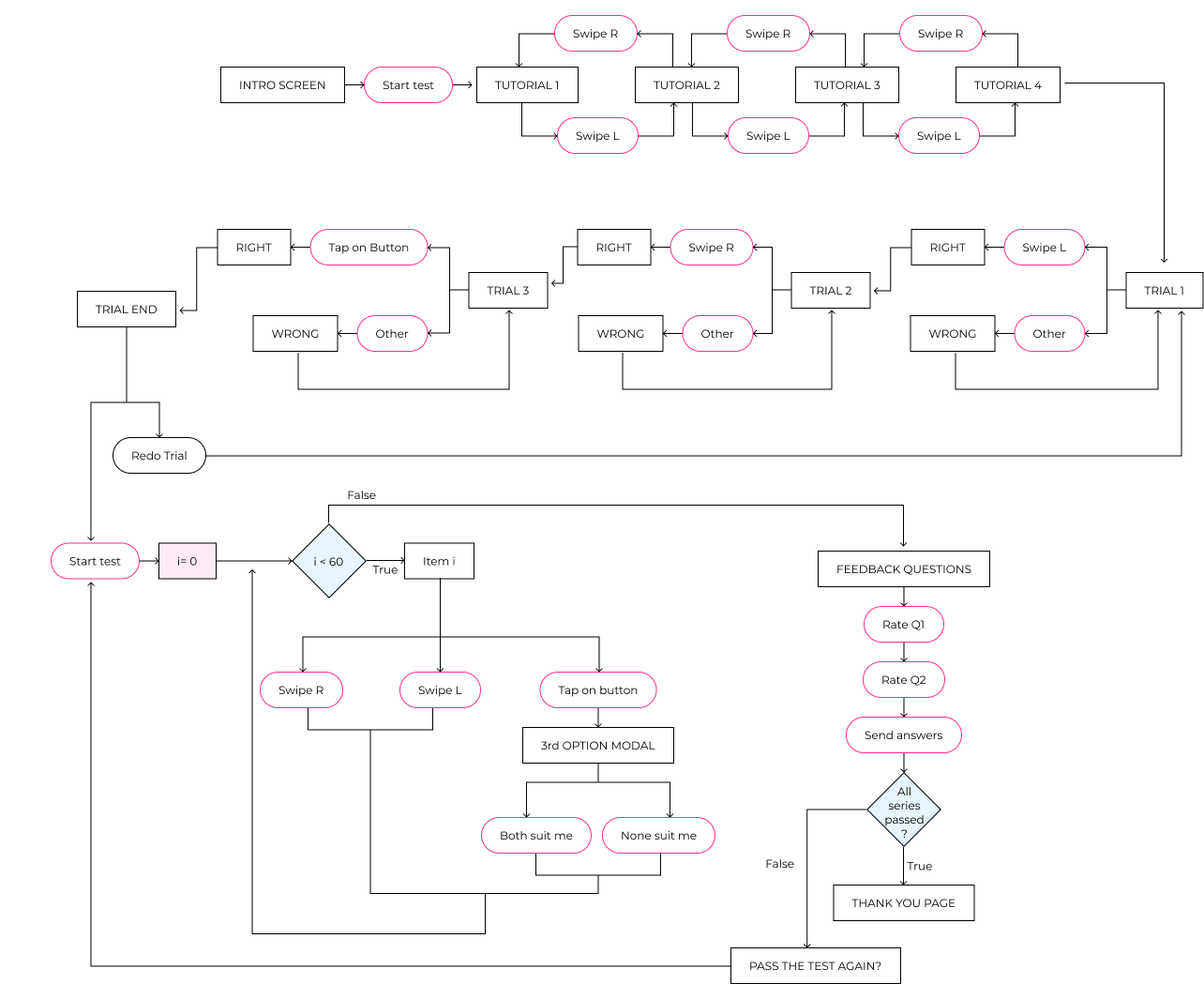
There were several screens to design.
First I focused on the most important part of the user journey, the questions or items (pairs of images to choose between). Once that part was designed, I could create the trial and the tutorial.
The test also needed an intro screen and two thank you pages, one in case the users can still pass another series of the test, and another one in case they already passed all the series.
Finally, I needed to design the screens for the after test feedback questions, which will give us some insights about whether we were improving the experience or not.
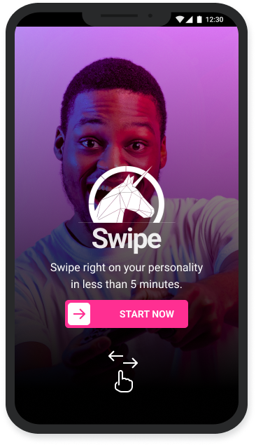
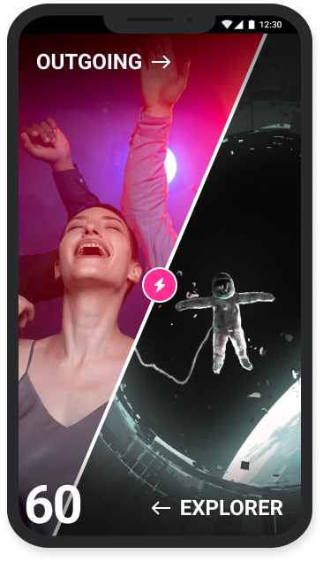
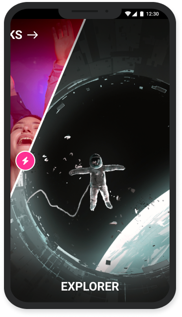
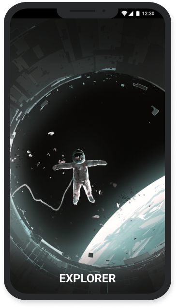
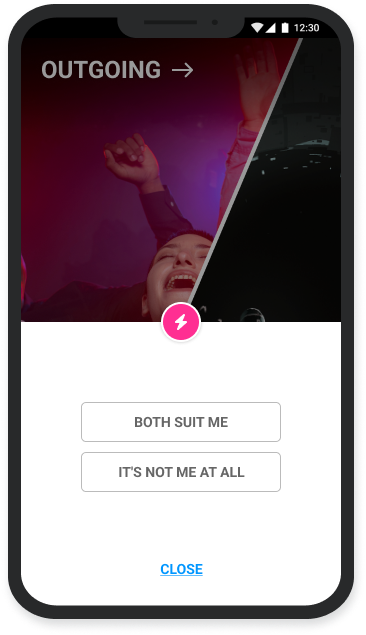
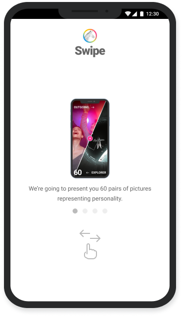
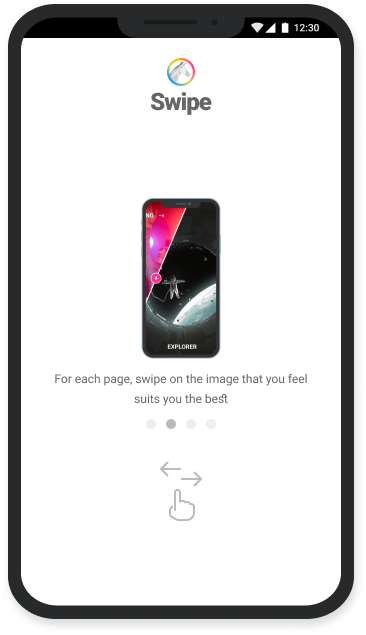
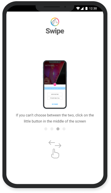
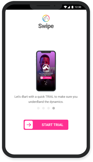
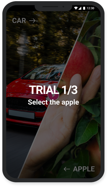
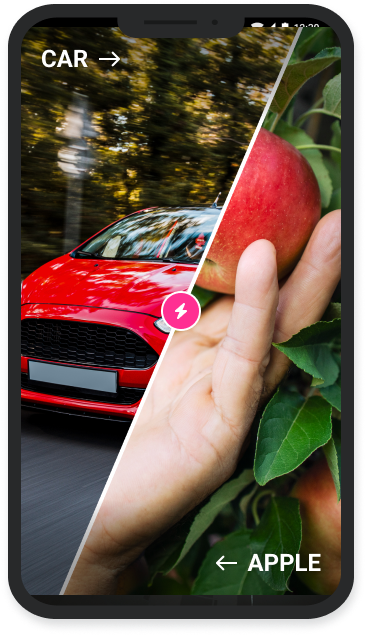
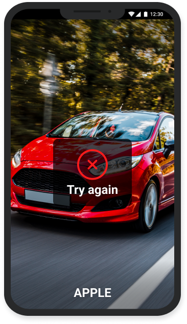
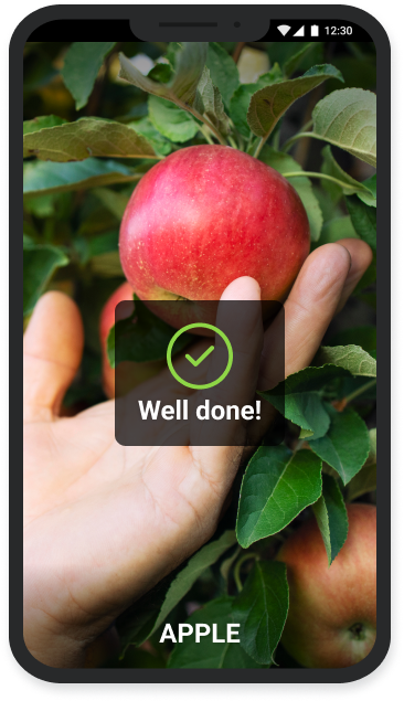
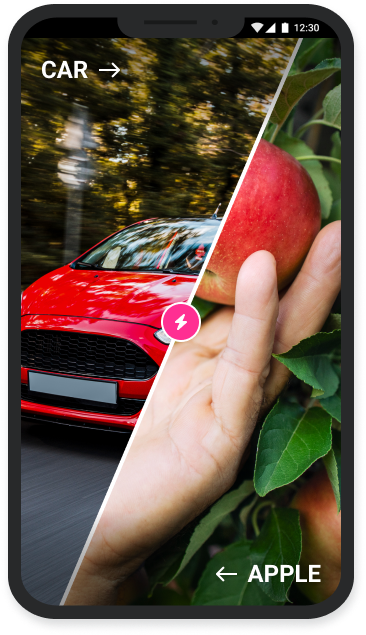
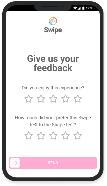
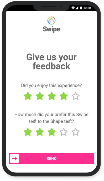
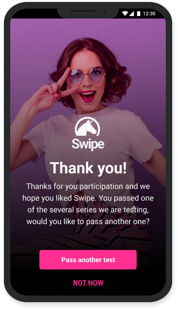
Of course, the swipe interaction wouldn’t work on desktop, so for this device I decided to simplify the interaction. To select between the pairs of images, a click on the chosen image would be enough. However, the arrow keys on the keyboard could also be used to choose an option, and the space bar to initiate the no-choice button.
The science team performed testing for 6 series of questions getting a lot of data and so important insights:
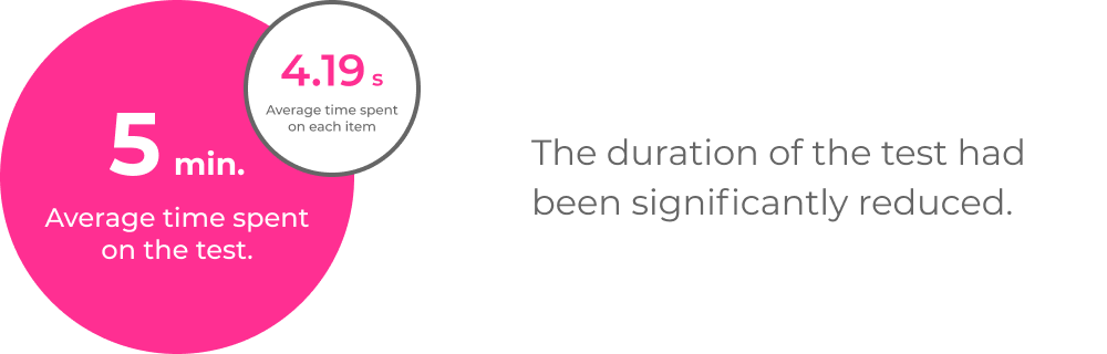
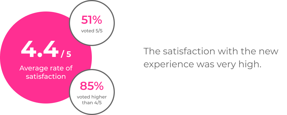
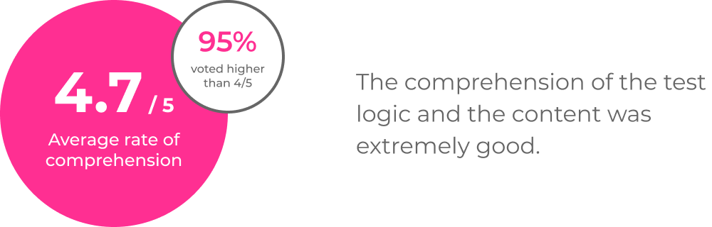
The feedback on the experience was great and the science team had the data to be able to choose the right questions for the final test. Then we define the specs for the final version:
On that basis we adapted the final user journey.
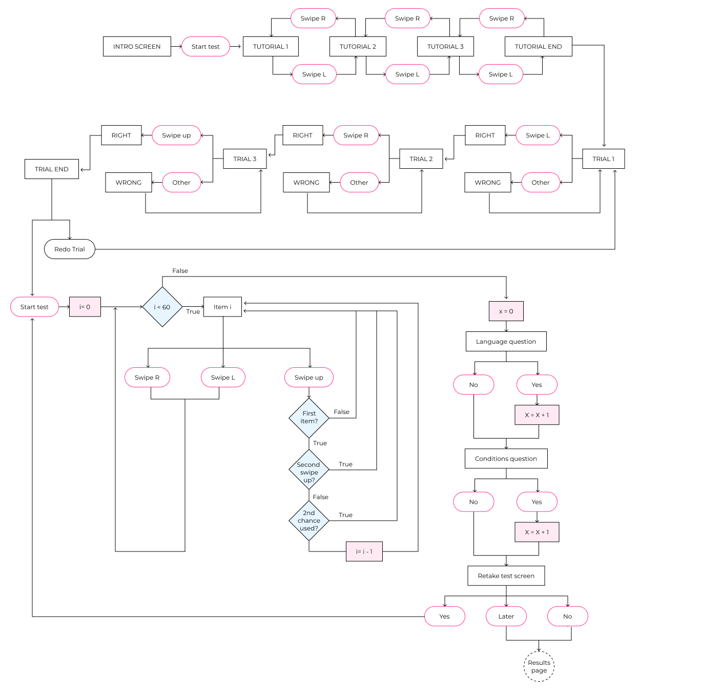
I was then able to work on the final screens and on a small prototype to define the interactions, animations and transitions.
Swipe personality test final prototype.
For desktop, again, we couldn’t use the swipe to return to the previous question, so I added a button in the top right corner of the screen for it. The up arrow on the keyboard would also perform this action.
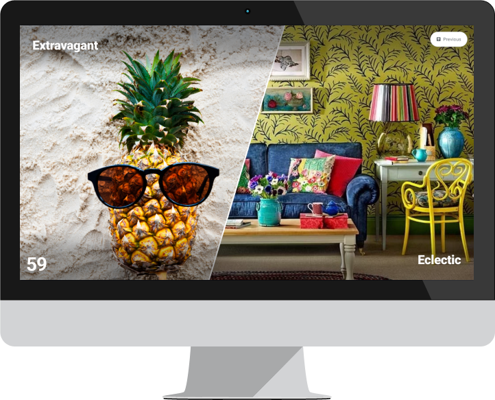
The new Swipe personality test was launched and the response from users was very good. Even still at an early stage, a higher user engagement was registered.
Something to improve would be the name. The name of the old test was related to the evaluation object of the test, it was called Shape because it reflected the personality of the user. The name of the new test referred to the main interaction used in the test, which does not imply any further meaning for the user. A more appropriate name should be found that refers to the personality.
© 2023 AARDesign. All rights reserved.
