The new AssessFirst data dashboard for administrators
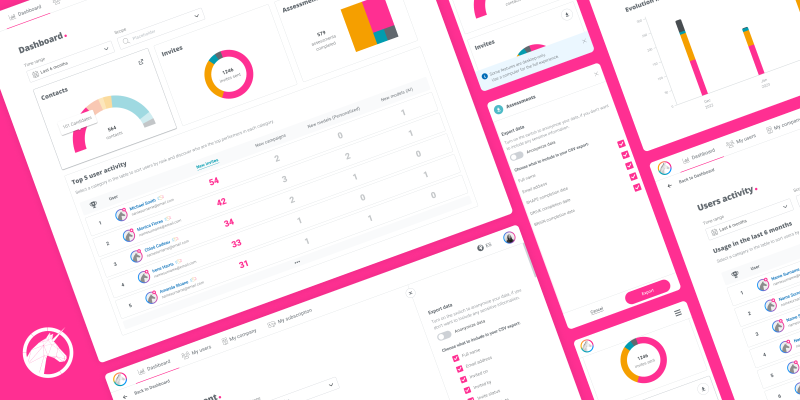
Year: 2023
My role: UX/UI designer
Company: AssessFirst inhouse project.
Team: I collaborated closely with the Product Owner during throughout the project. I also shared the designs with the front-end developers to validate the technical aspects and worked with the Localization Manager to define the best way to approach the texts. The Sales and IT teams were also involved during the discovery, by giving information about the problem found. Finally, the Customer Success team was asked for feedback about the project we were building and the user test we would perform.
In the administrators’ portal there was a dashboard page showing some data about the account usage, but data tracking and user feedback clearly pointed out that users didn’t use it. Still, users were contacting AssessFirst to get reports on the usage data of their accounts. Therefore users needed a data dashboard were they could export the data, but the one in the app was not fulfilling their needs.
We would redesign the feature and offer users a real data dashboard to achieve 2 objectives:
In a more intuitive dashboard with more valuable data users would perform their own tasks without intermediaries
More autonomous users would decrease the reports request giving the AF teams time to work on their own tasks
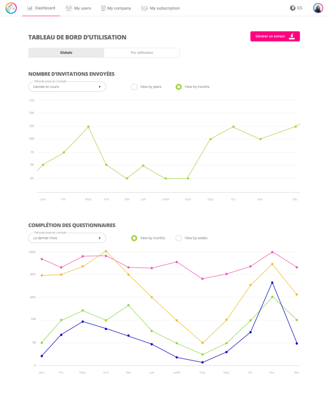
Admin Data Dashboard BEFORE the redesign.
1. Discovery: Analysis of the data and interviews with Sales and IT to understand users’ needs and define the main KPIs.
2. Product definition : Definition of the specifications and user flow.
3. Design proposal: Research on data visualization, design of wireframes.
4. User testing : Definition of the user testing plan to answer our questions, creation of the prototype for the conducted test, tests with users and conclusions.
5. Final solution : Wireframing and prototyping for the final version after user testing insights.
First thing was to understand better the admin users’ needs in terms of data. For this, we met different teams and gather some information on the topic.
The Sales team was often asked to perform the administration actions for several clients so they could tell us about which information the customers were interested in and why. Being able to check the data for each scope in the company and for different time ranges was very important for the clients. They were interested in knowing about the contacts’ joinning day and their last connection. They also wanted to know about invitation status and each contact test completion status to send reminders. Finally, administrators wanted to know about recruiters’ last connection time and their usage of the different recruitment functionalities.
We also asked the Chief of IT, who was asked to export data reports for clients every week, for a list of the reports the clients required. We checked the number of clients asking for each report and the periodicity of the requests to identify the global KPIs main users were interested in.
With all this information, and a new contact role concept we were introducing, we defined the 4 data sets to be displayed in the admin dashboard.
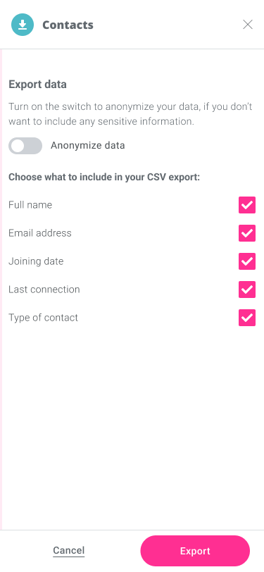
Contact name and email, joinning date, last connection and contact role
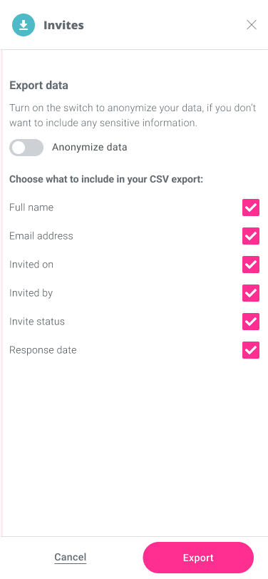
Contact name and email, invited on, invited by, invitation status and response day
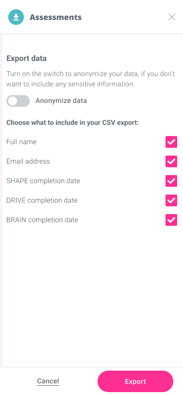
Contact name and email, SHAPE completion date, DRIVE completion date and BRAIN completion date
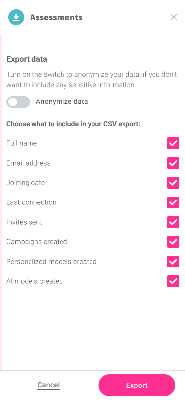
Recruiter name and email, joinning date, last connection, invitations sent, campaigns created, Personalised PM created and AI PM created
The aim of the project was to create an actual data dashboard: a summary of different, but related data sets, presented in a way that makes the related information easier to understand. Once we knew what global KPIs would make up the data sets, we could define the funcional specifications.
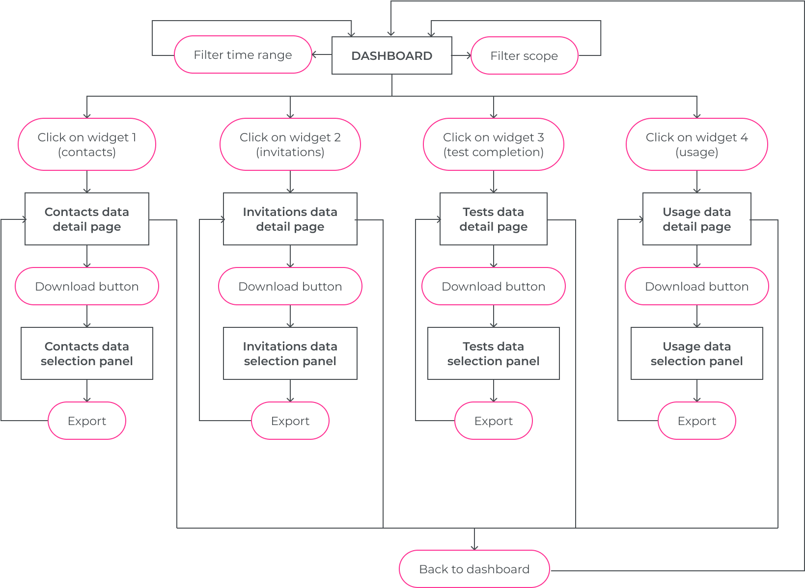
Users needed to be able to filter by company scope if having more than one
Users needed to be able to visualise the information for different time ranges
Users needed to visualise a global summary of the data
Users wanted to visualise the evolution of data over time
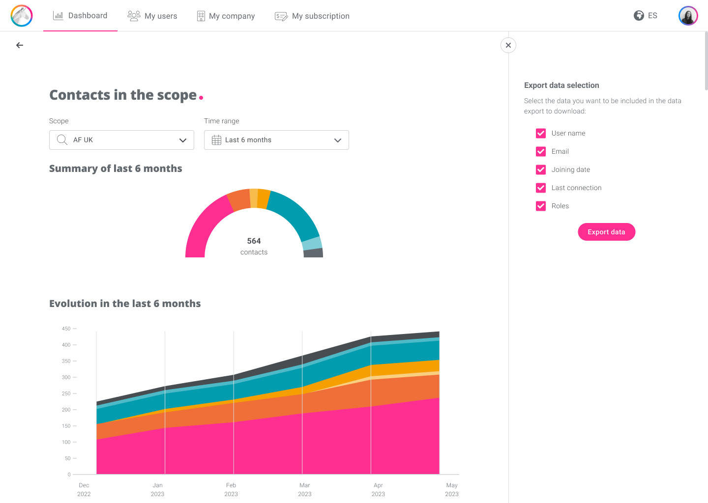
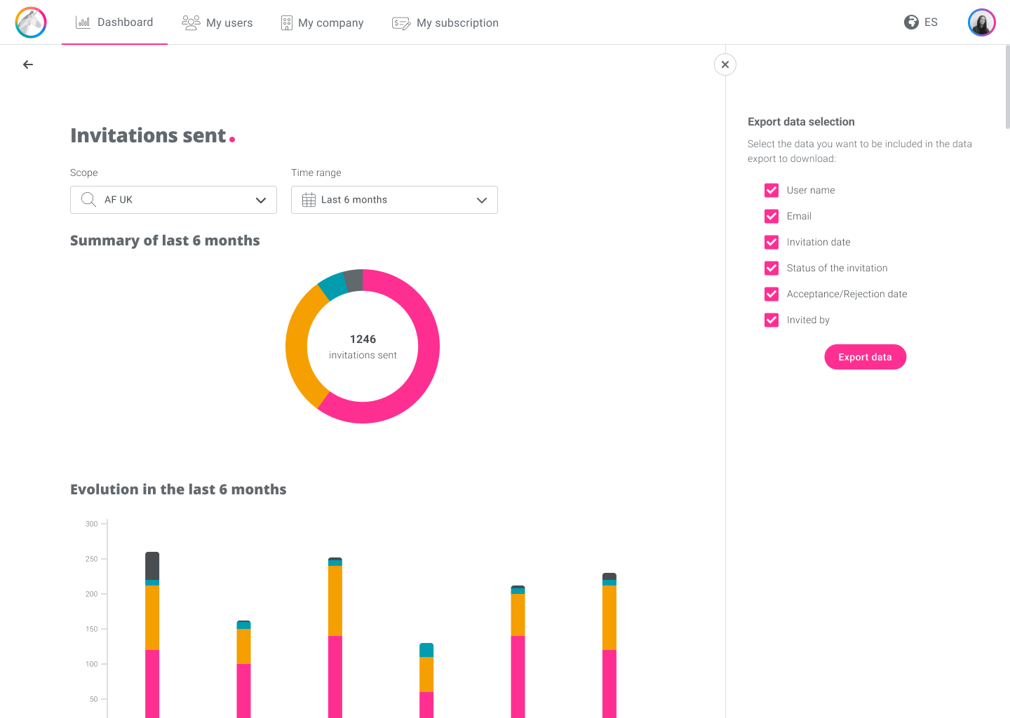
Users needed to download the data in a file
The new data dashboard would be designed based on the new design system and desktop first, as admin users use the application for work on their desktops, but it would be adaptive design for mobile and tablet.
On that basis we also built the user flow:
When designing the feature wireframes, the first thing was to find the right data visualization for each KPI. Each type of graph has attributes that help to better communicate certain information or others. For example, to represent the parts of a whole, a pie chart is very useful, but in order to represent the evolution of the data over time, a graph with a time axis will be necessary.
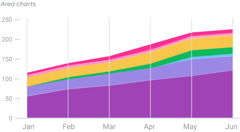
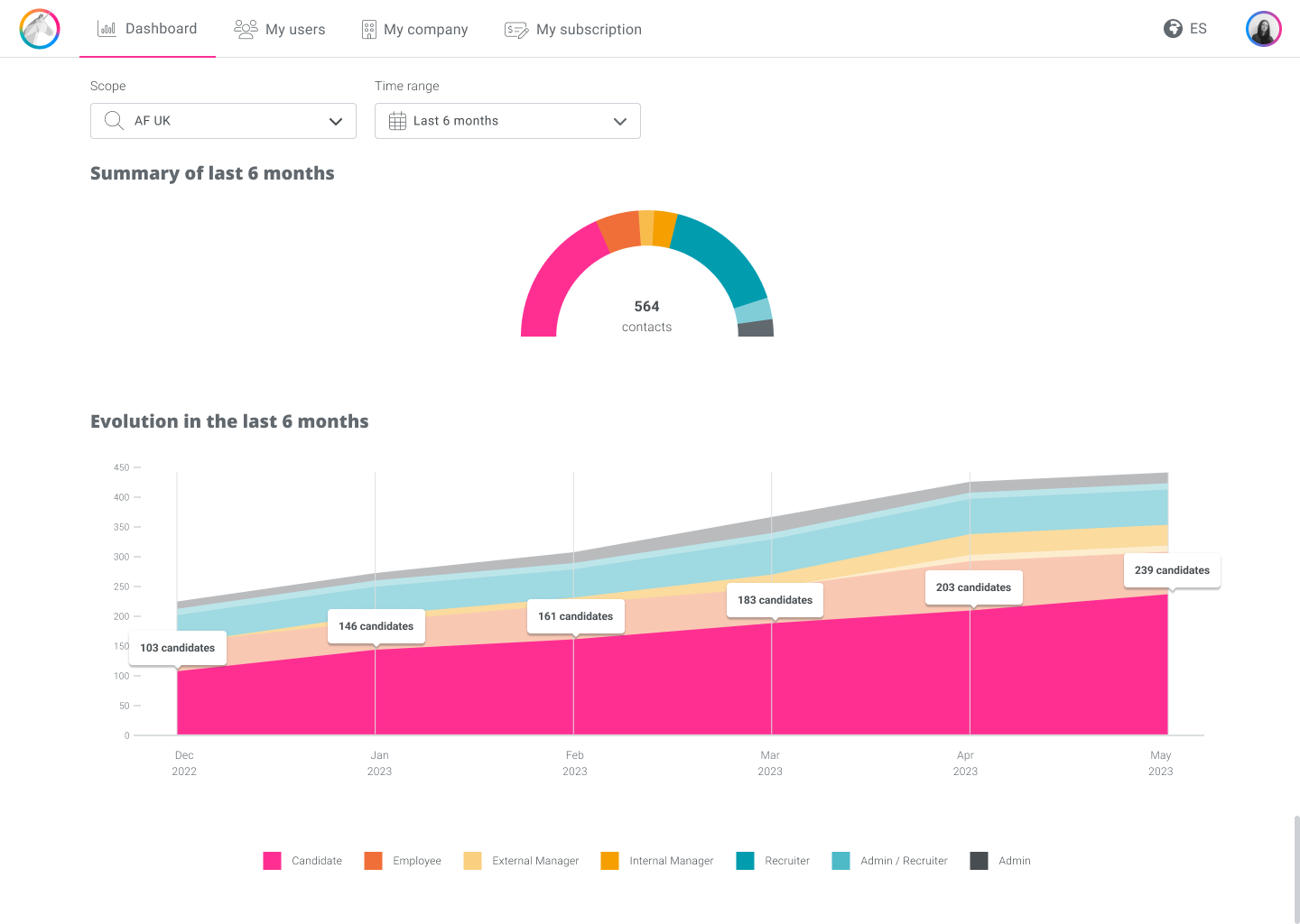
Contacts are those users who have agreed to share their AF profile with a certain scope of a company, whether they are candidates, employees, managers or recruiters. There are a total of contacts that can be divided into roles, so a pie chart or one of its variants could fit for the overview and an area chart could show the growth tendency of each role over time.

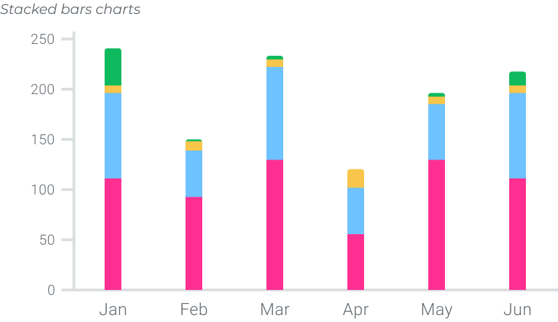
Invitations are contact requests that recruiters send to candidates or employees, whether or not they are AF users, through their email addresses. Invitations can be pending, accepted, declined, or deleted. When a recipient accepts an invitation, they become part of the contacts of the scope from which they were invited. Again, there are a total of invitations sent that can be categorized, so a variant of the pie chart would fit well. In order to differenciate it from the previous KPI, a different variant could be used. To show the evolution over time, as the trend in this case is not so important, a stacked bar chart could be used.
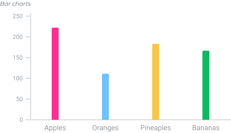
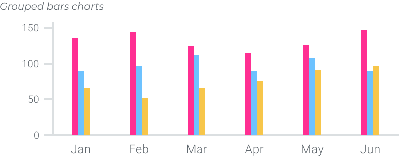
Another KPI was the test completion. The application offers 3 tests: SHAPE regarding personality, DRIVE regarding motivations and BRAIN to refer to the way of thinking. Considering each test as a category, and in order to compare how many users have completed each test, a bar chart could work, and to make the comparison over time, a grouped column chart.
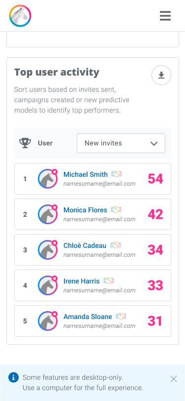
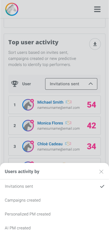
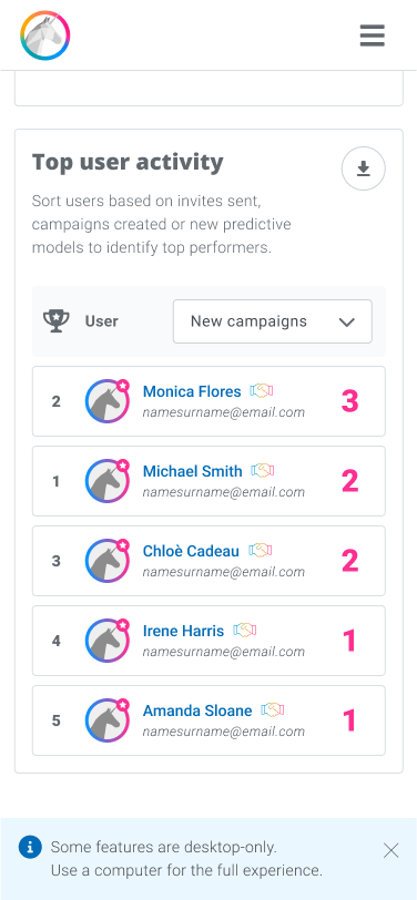
The purpose of the last KPI was to analyze recruiter usage and see how many times each user performed each recruiting action. With the Product Owner, we thought it would be interesting to approach it as a ranking of recruiters that could be sorted by action. The overview would show the top 5, and expanding the information would access the entire list.
Once the different graphs to use for each data set were defined, I composed the dashboard and designed the interactions, the detail pages and the export panel. First I focused on desktop wireframes, since administrators use the application as a work tool, normally on the desktop.
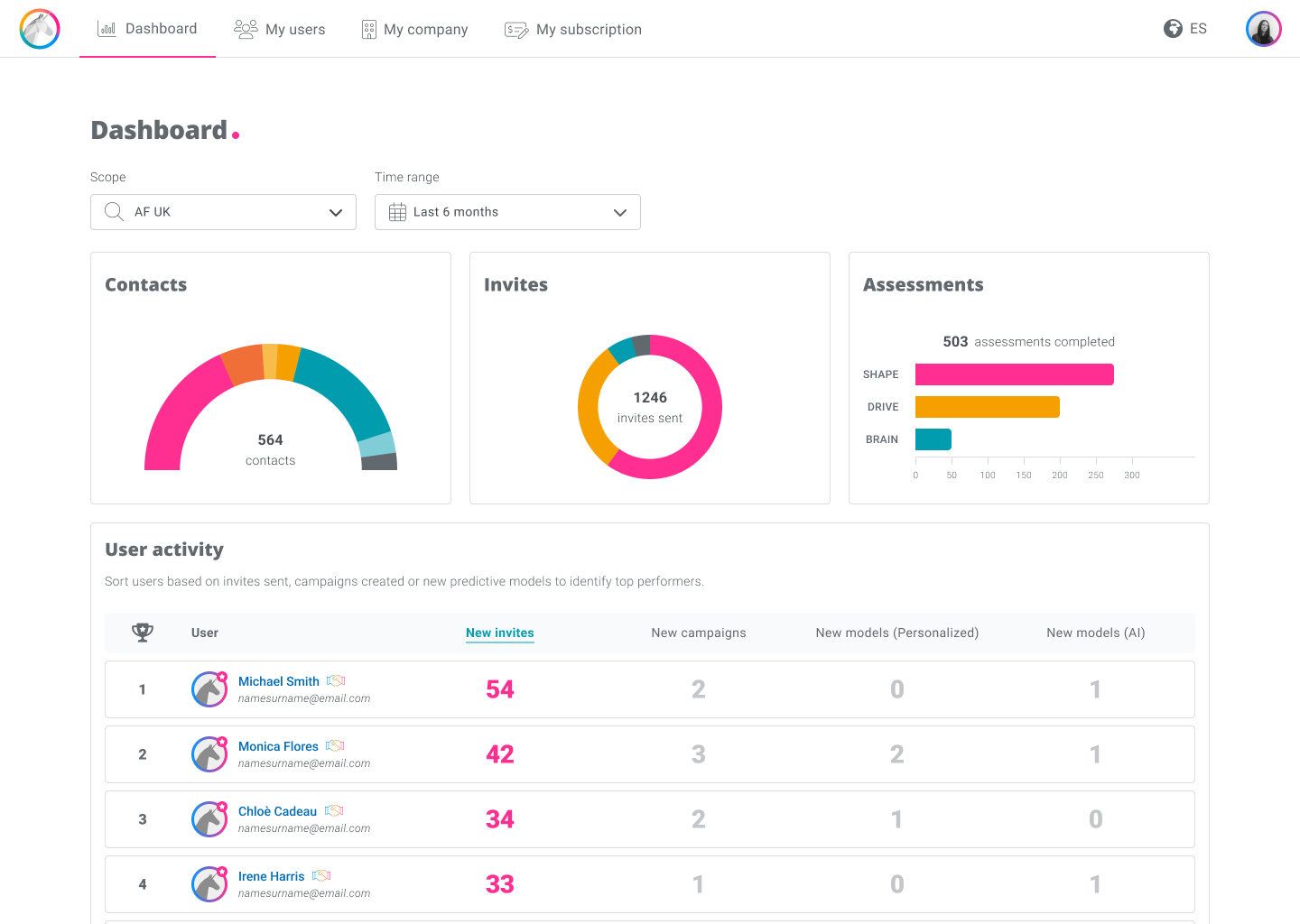
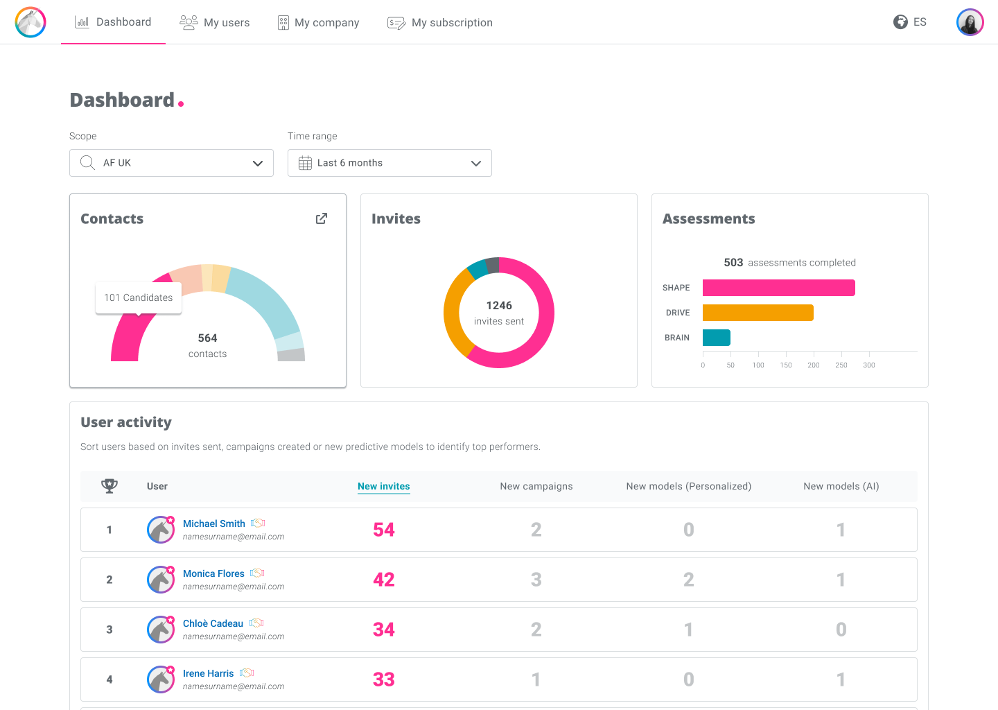
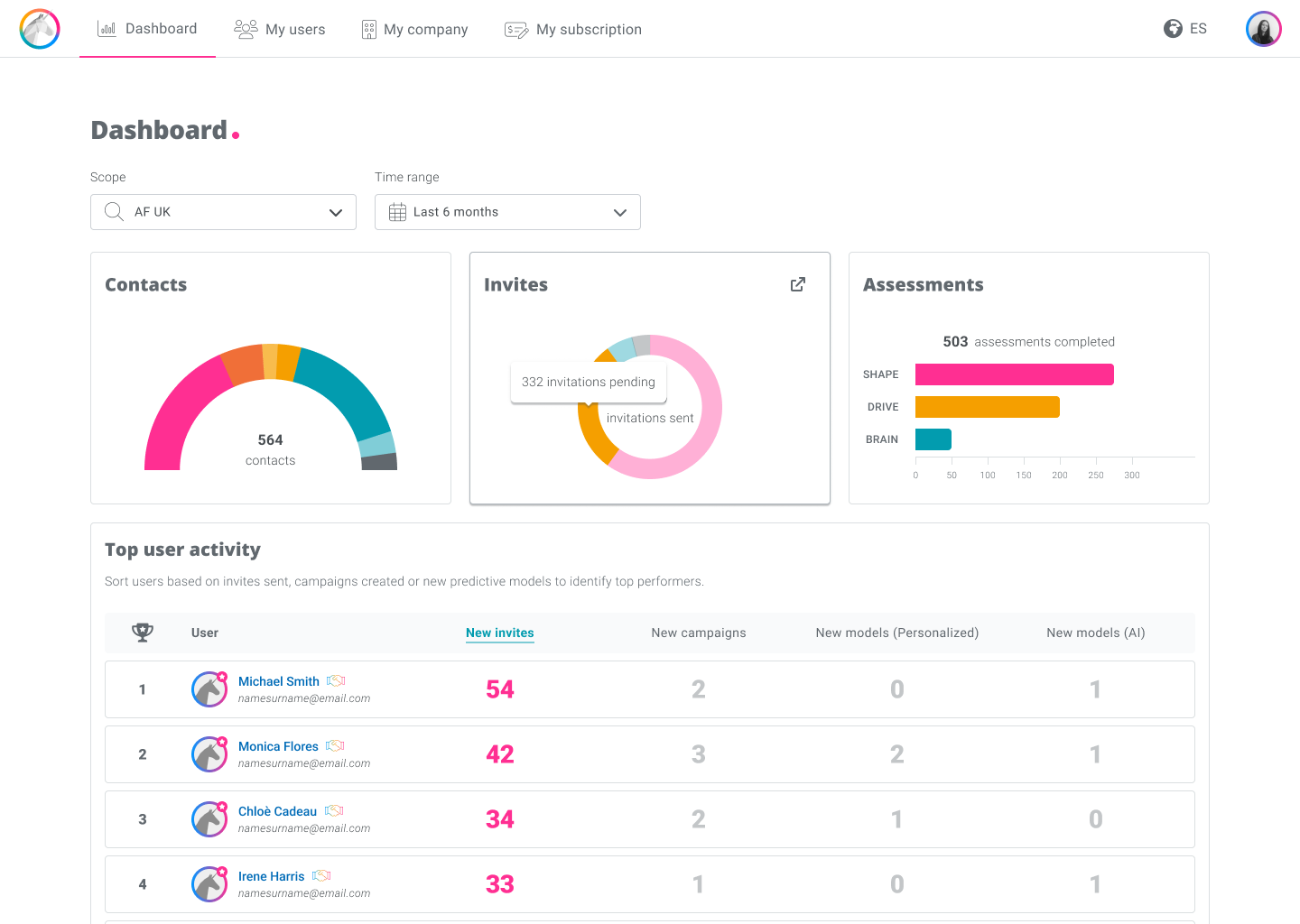
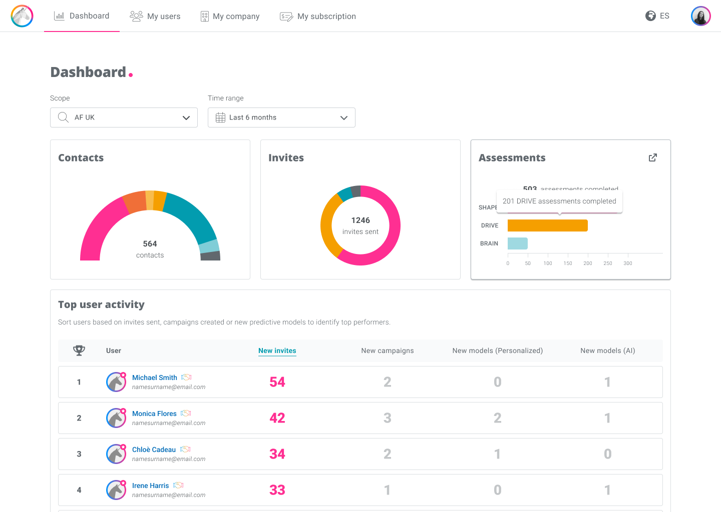
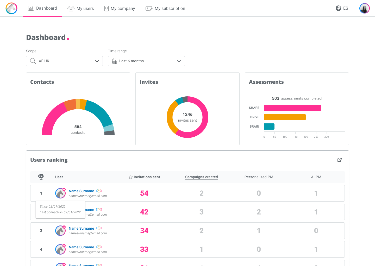
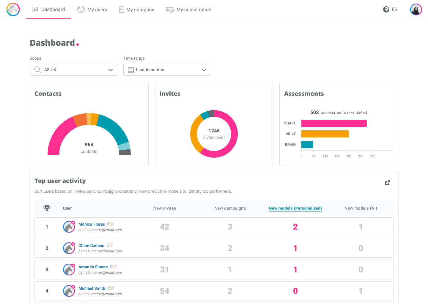
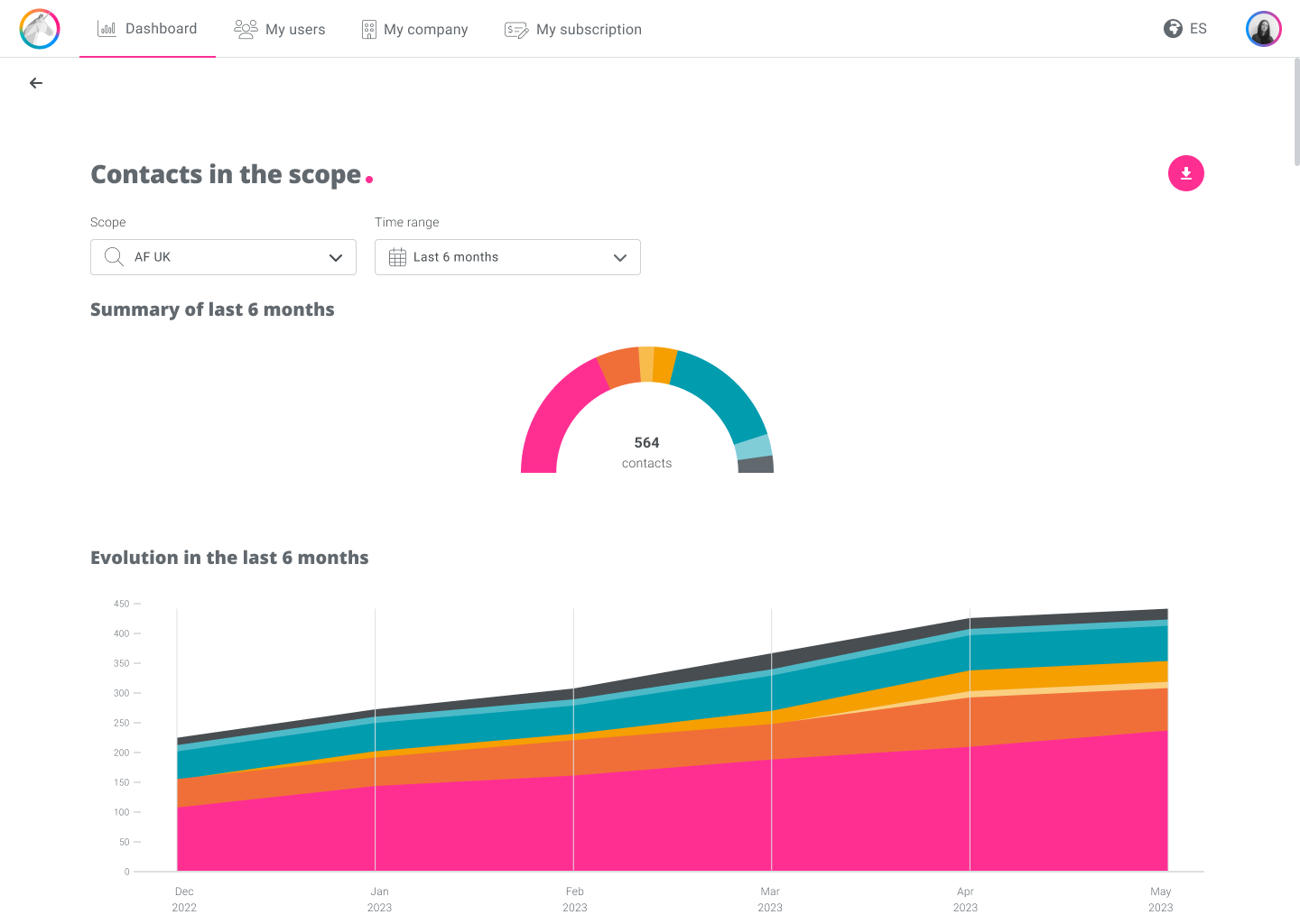
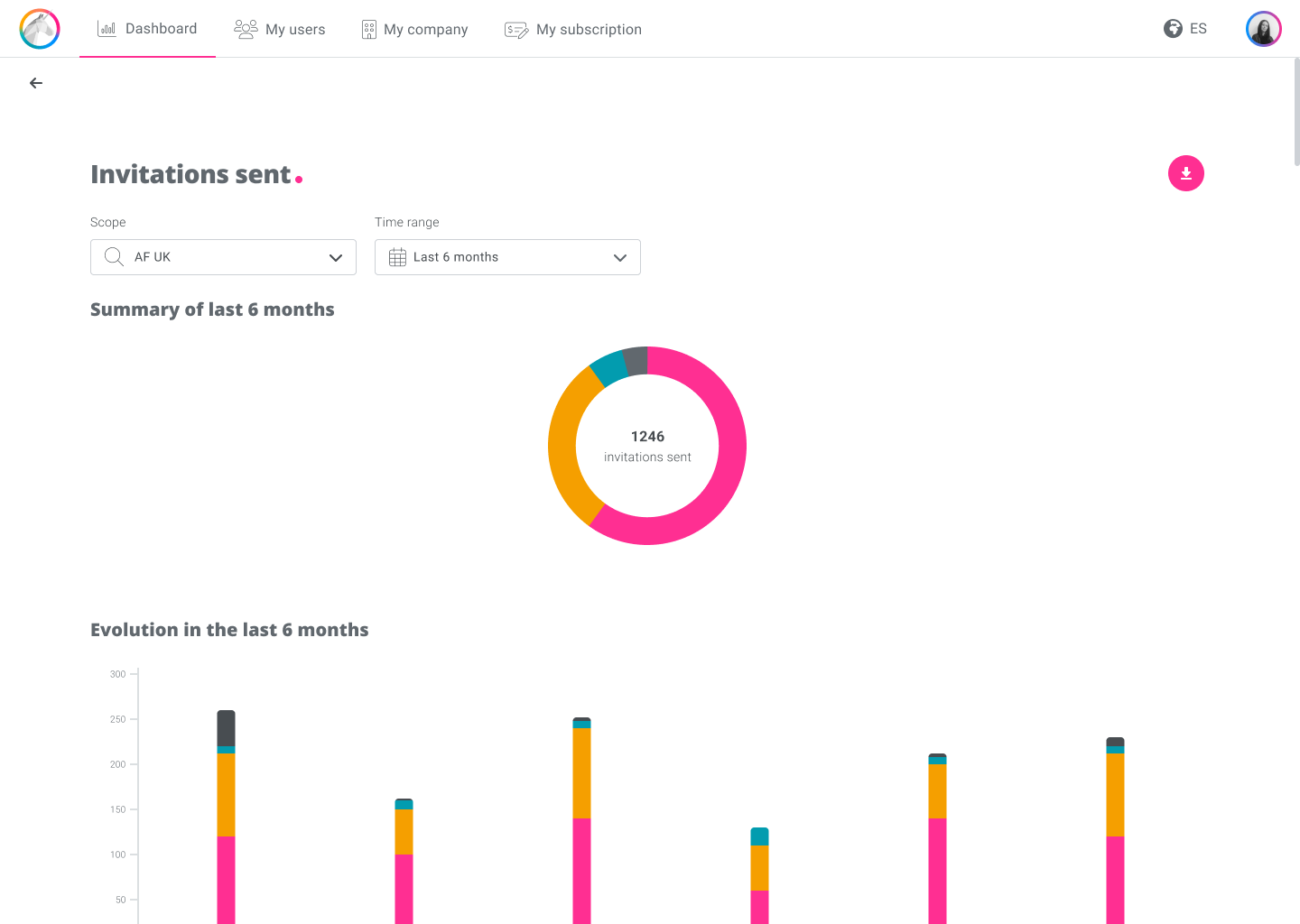
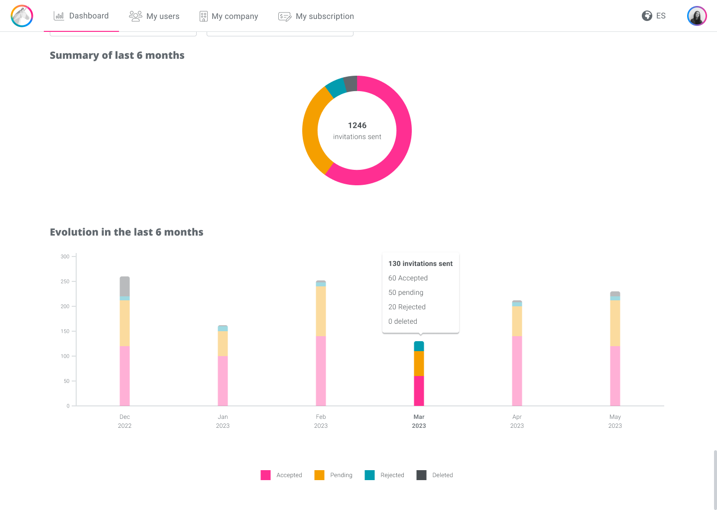
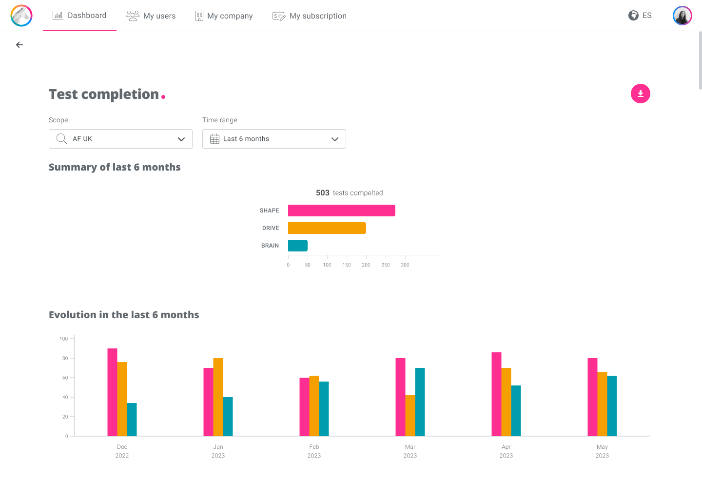
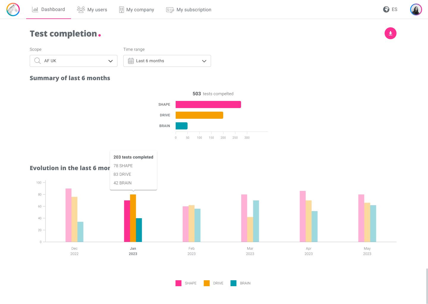
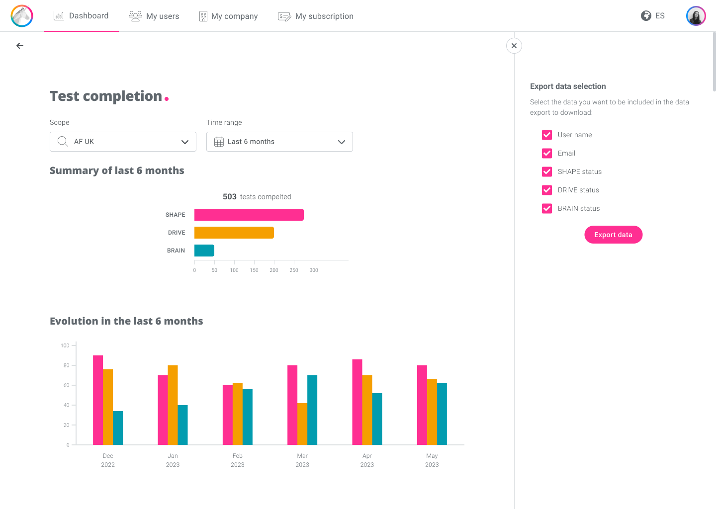
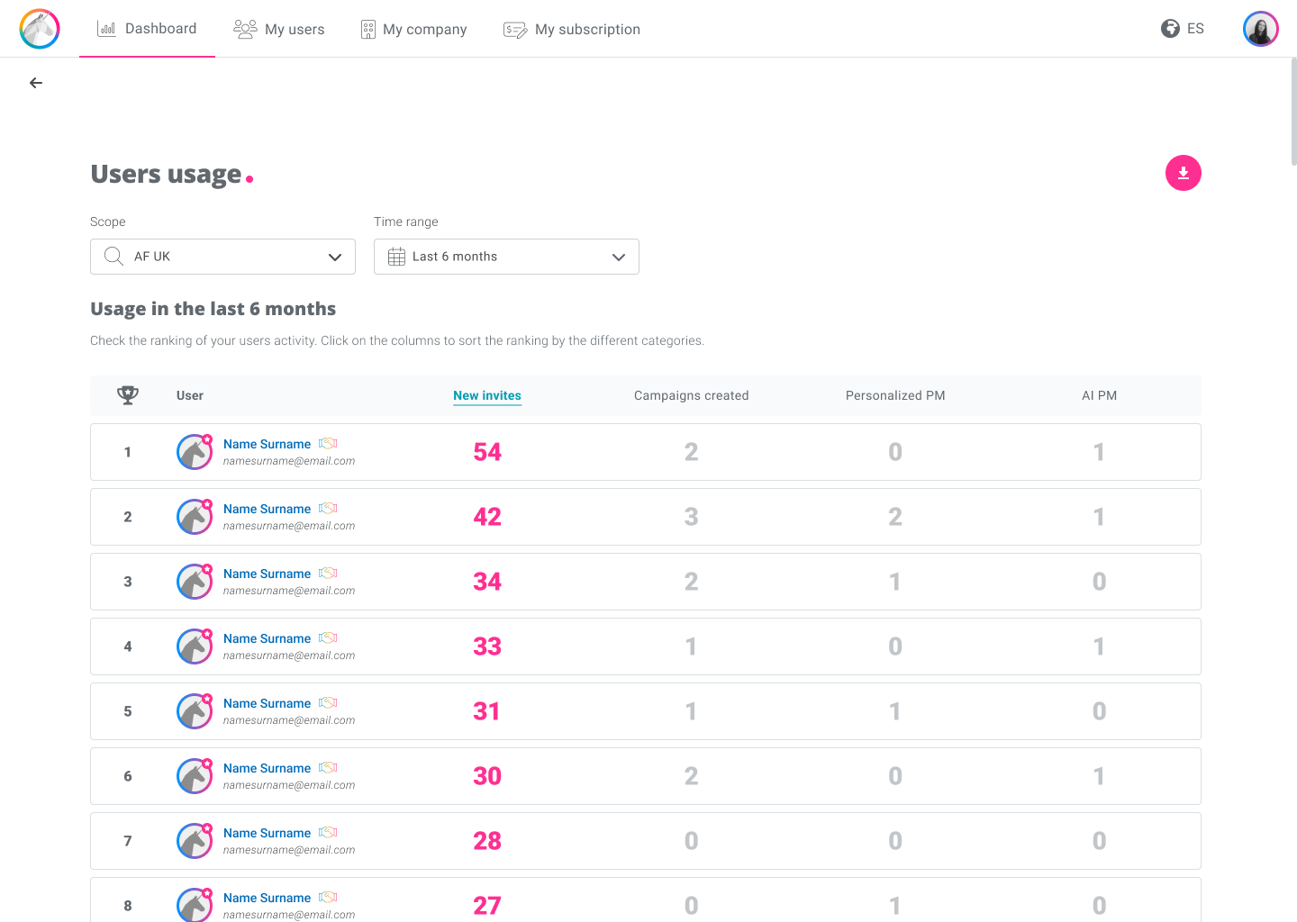
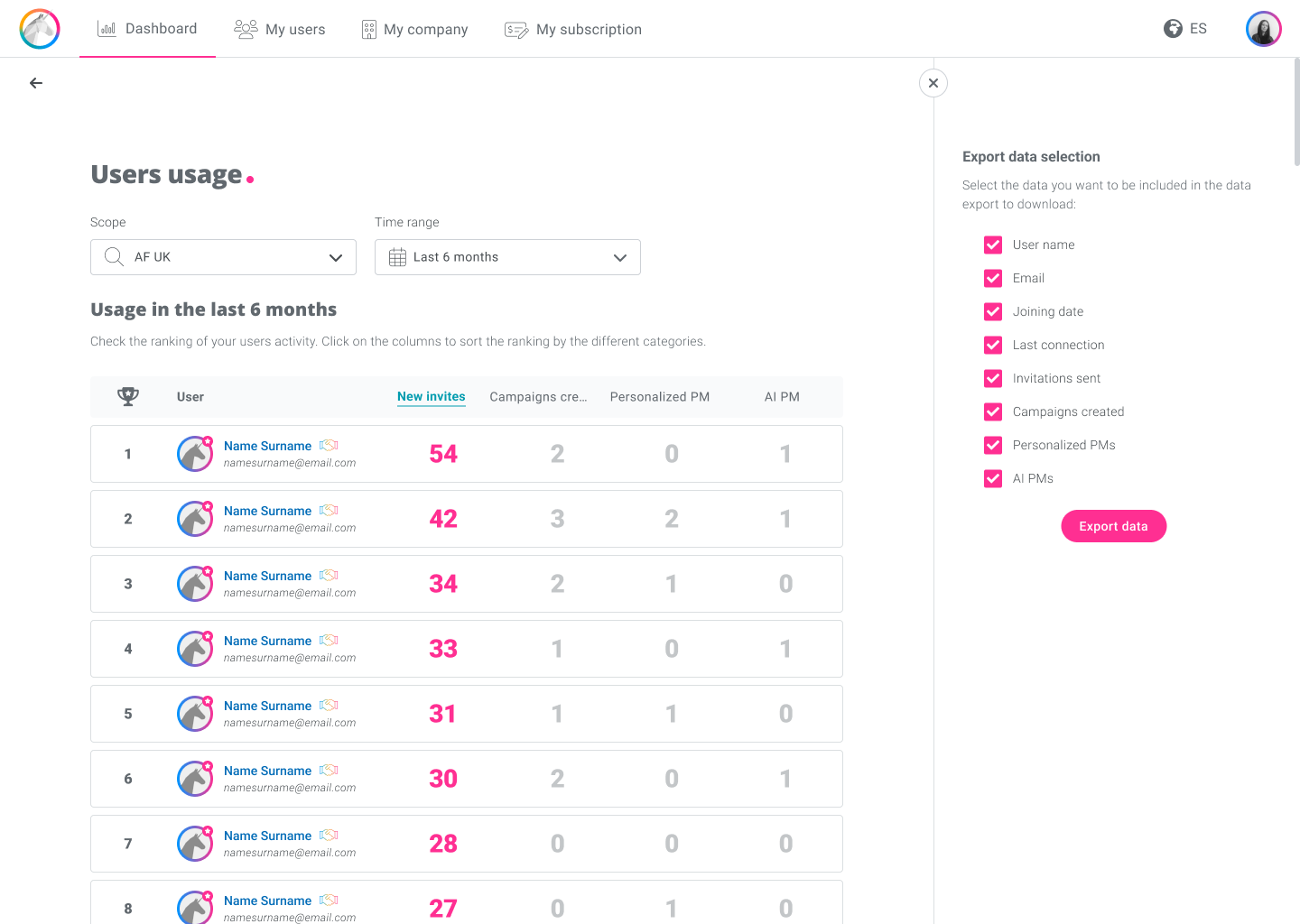
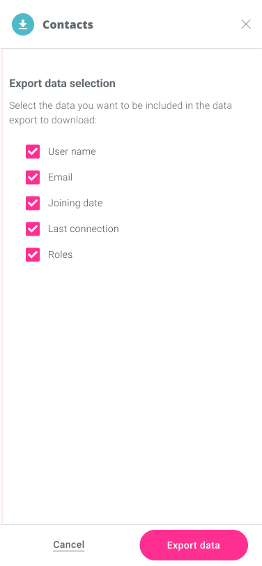
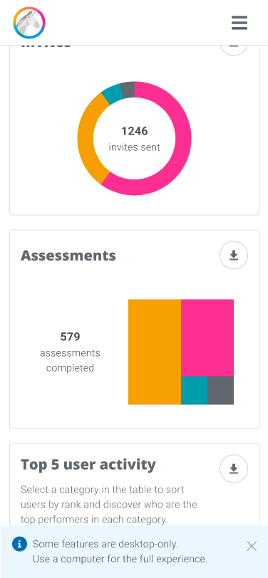
With a first design proposal for desktop, I was able to see how to adapt it for mobile. We wanted to offer all the information possible on mobile without detracting from the user experience. So, I kept the summary view of the page and the possibility of downloading the data, but I decided not to include the temporal evolution (details page) on mobile, since the readability was not going to be sufficient due to the dimensions of the device and was going to spoil the experience.
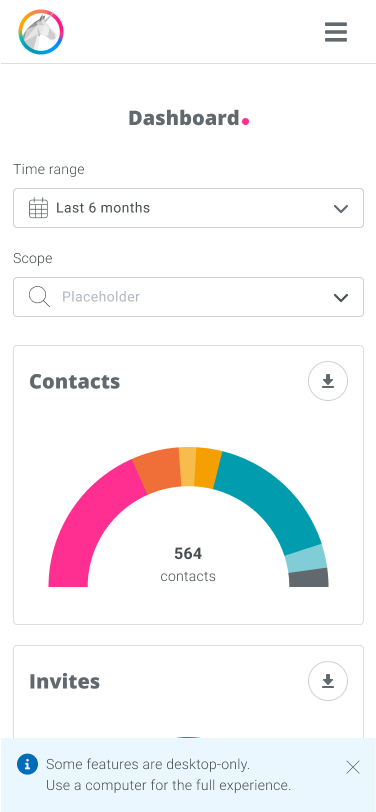
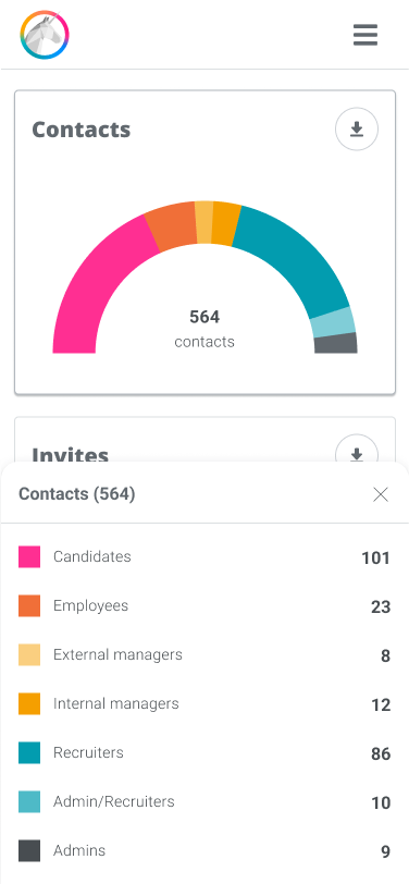
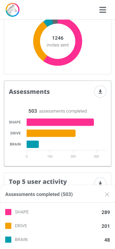
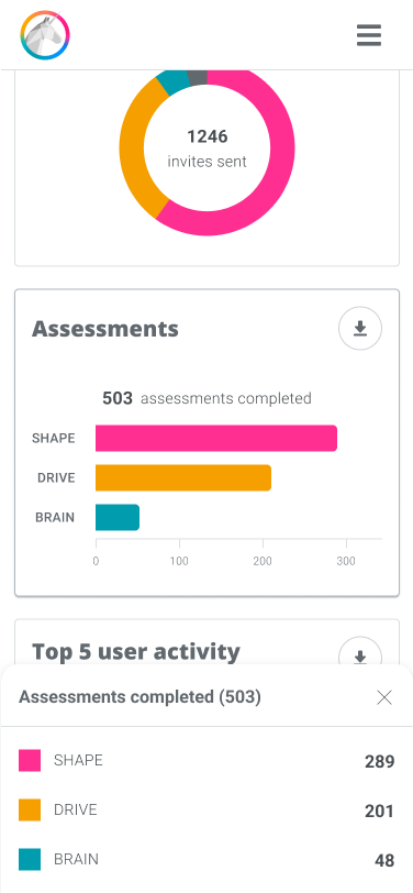
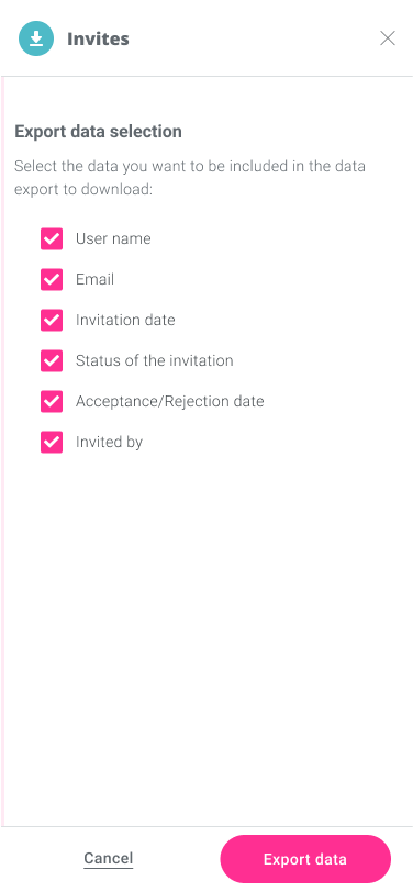
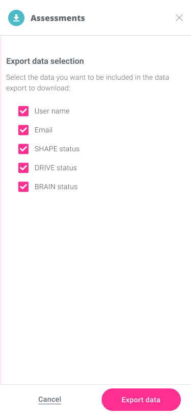
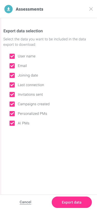
We had a design proposal and we needed to test with users if the solution was intuitive and usable, but also if the information displayed was valuable, understandable and covered the users’ needs. Did users encounter any difficulties to interact with the different elements such as filters, widgets, charts or exporting options? Were they understanding the data in each chart? Was this data valuable? Was any information missing?
To answer our questions, we would ask them to perform some tasks to see how they interact with the design while they explain out loud what they do, and ask them some questions about the content to see if they understand the information. I defined 5 tasks users would need to complete:
Filter and explore. Users needed to filter the UK scope data for the las 6 months and answer some questions about the data in the page. This way we could test the interaction with the filters and see if users understood the data visualization.
Expand the data about contacts. Users were asked to expand the data on contacts and answer some questions about it. This tested the users interaction with the widget and the understanding of the charts displaying the data.
Expand the data about invites. Users needed to go back to the dashboard and expand the data on invites to answer some questions. Besides testing the understanding of the previous expanding behavior and the charts, this task tested the user interaction with the “go back” button.
Expand the data on tests. Again users needed to go back to the dashboard, expand the data on the test completion and answer a question. This would give insights on the users’ understanding of the data and of the general behaviour.
Export the recruiters usage data. Users were asked to export some specific data about recruiter usage to test the understanding and interaction with the exporting solution.
To perform these tasks the users would interact with a conducted test prototype designed for it. This prototype was first shared with the Customer Success team to validate the prototype and the tasks understanding.
Having the user test ready, with the Product Owner we meet 10 clients willing to help us improve our solution. They belonged to companies of different sizes and geographical presence. The tests were performed remotely via video call. After the task completion, we asked users for their impressions and needs, to understand better the validity of the solution.
The general feedback from users was positive, they found it intuitive, appealing and useful. Main behaviours, such as filtering, expanding information, or exporting data, were clearly natural to them. Still, there were some improvements to be made.
The way test completion KPI was visualised was not really valuable. Users wanted to know the completion status for each contact, not how many contacts completed each test. This visualisation needed to be rethought.
The usage widget was not perceived as a ranking of the top recruiters, so most of them were not interacting with the table columns but just looking at the numbers on the displayed recruiters’ cards. Only 2 users clicked on the columns to sort the ranking, but also another user asked for this exact behavior in the after test conclusions. So here we needed to be more explicit about the top 5 ranking system and about the option to rank by column.
All the users understood the “Go back” button when seeing it, but some of them took some time to find it. Having a permanent label next to the icon would solve this problem.
During the tests we also realised some users were not scrolling the details pages to the bottom and they were missing the legends. As there was space for it, the legend could be moved up.
Hover behaviours were clear in general, but a few users took some time to realise they got more information when hovering the charts. Even if once they had hovered one chart they found it natural to do the same with the rest, having an onboarding tutorial for first time users could improve the exprience.
In conclusion, we had some improvements to make but we were on the right path and definitely offering users a much better solution than the previous one.
The insights the test gave us allowed me to work on the adjustments for the final design.
We would include an onboarding tutorial for first time users, work on the recruiters’ usage widget texts to make the top 5 ranking explicit, add a label to the “Go back” button and move up the legends in the details pages.
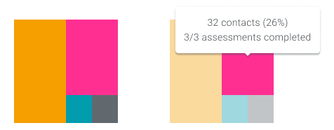
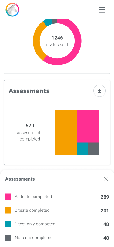
But the biggest improvement was on the test completion KPI visualization. Approaching it as a completion rate for each user, we could represent all users as a whole and group them into 4 categories: 3/3, 2/3, 1/3 and 0/3 test completed. A pie chart would be perfect for this. In order to differenciate it from the other KPIs, I decided to use the waffle chart variant. This chart might be less familiar for users, but the square shapes allow them to compare better the sizes of the different area partitions.
For the evolution view chart I decided to reuse the stacked bars chart as it proved to be appreciated by user during the test.
After our conversations with test users and a little chat with the Legal team, we decided to also add a toggle to automatically anonymize the data in when exporting.
After these adjustments, the final desktop design was ready to be developed.
Of course the applying adjustments were done in mobile too.
The new admin dashboard promised to be a success after hearing encouraging user feedback, even before we made the improvements found during testing. Users liked the feature so much that they requested a similar dashboard for the recruiter portal.
To verify that the new dashboard really increases the usage and decreases requests for actions and reports to the Sales team and the Chief of IT, usage would be tracked once the feature is launched, hoping for the results to be positive.
I personally enjoyed a lot working on this project, better understanding the KPIs of interest to administrators and their needs. I find data visualization a very interesting topic and the project allowed me to delve deeper into it. Furthermore, the process was very fluid, the collaboration with the Product Owner was great and the trust he placed in me helped me get more involved in the project.
© 2023 AARDesign. All rights reserved.
