The path to product consistency, efficiency and flexibility
Year: 2022-2023
My role: UX/UI designer
Company: AssessFirst inhouse project.
Team: This was a huge project, involving several teams in its development. I collaborated closely with other Design team members throughout the entire process. During the previous branding review, we worked with the Marketing team, the CEO, and the Product Manager. When defining and designing the design system, we also worked with the Front-end Developers team.
Introduction
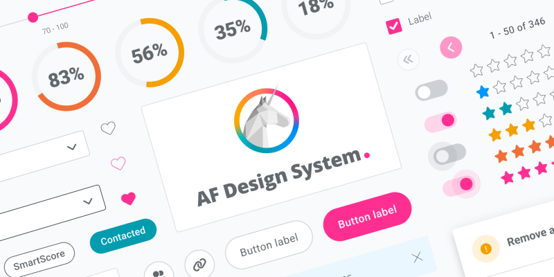
A design system brings uniformity, consistency and efficiency to the user experience, as well as streamlining product design and development processes. With the growth of both the app and the AssessFirst team, it was clear that a design system would be the solution to the challenges brought about by this growth.
Lack of brand consistency
Lack of coherence between product design and marketing materials.
Lack of consistency
Lack of consistency between design elements and code.
Accessibility issues
Accessibility problems in the code and in design fundamentals such as colors or typography.
Inefficient process
Waste of time on designing and developing the same elements several times.
The process
1. Branding review: Collaborating with the Marketing team, CEO, and Product Manager, we did a complete review to update and redefine the brand.
2. Technical definition: The Development team defined a new framework, establishing essential guidelines and design requirements.
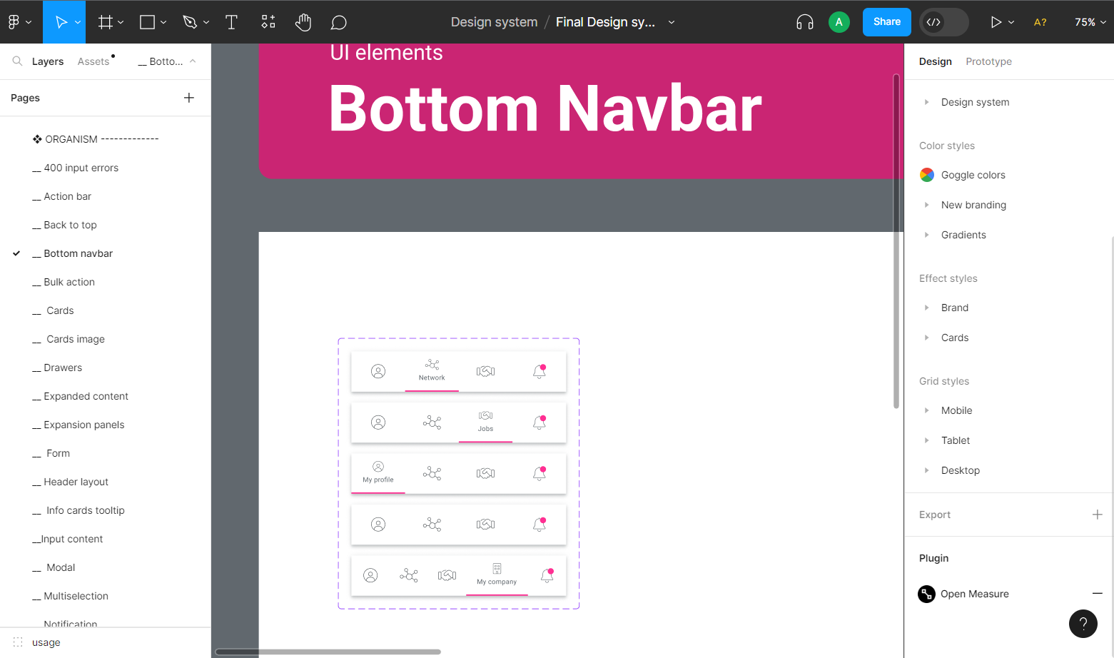
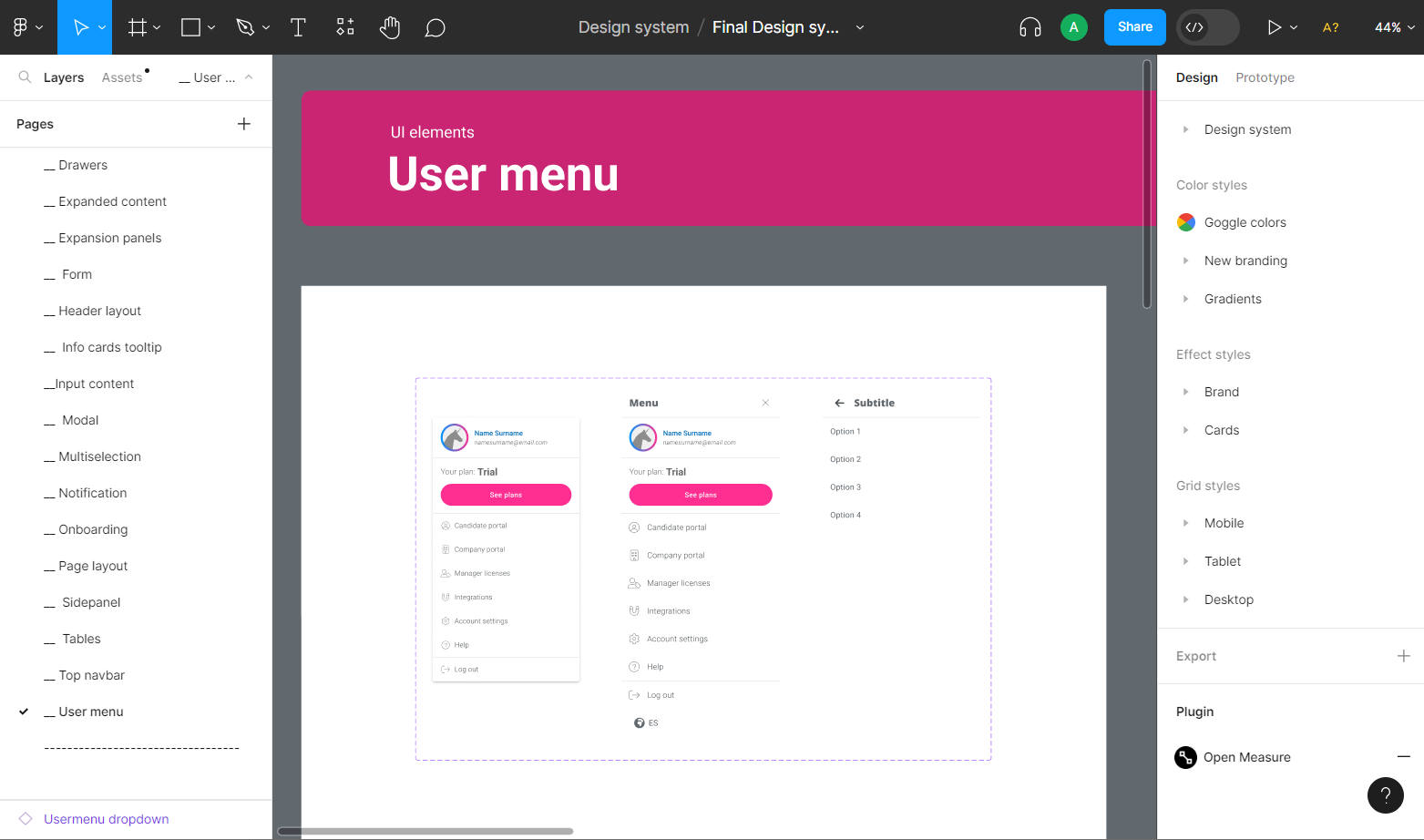
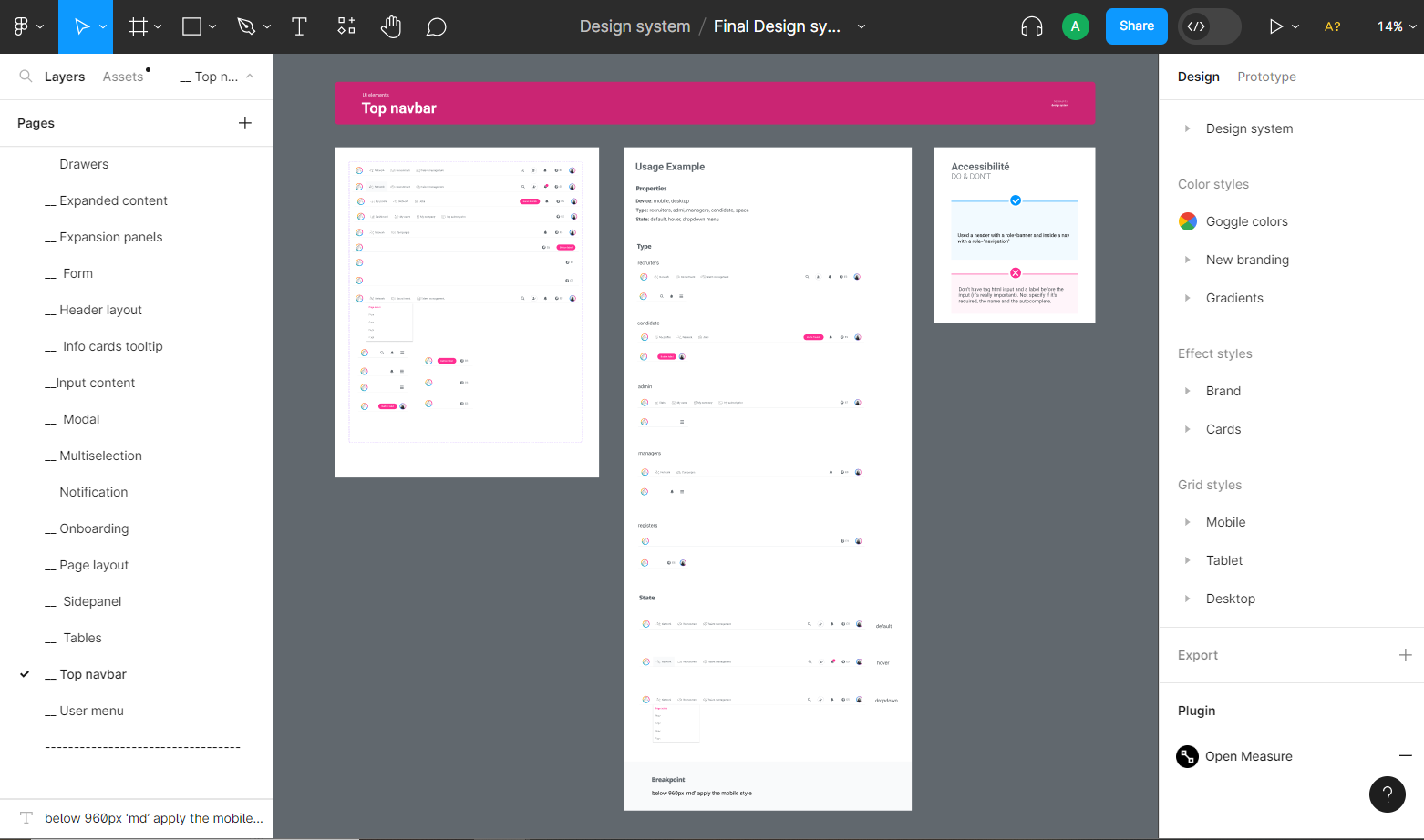
3. Design phase: We worked on the design of atoms, molecules, organisms and patterns, taking care of the application needs, accessibility and creating the corresponding documentation.
4. Development phase: During the development of the components, the design team was able to test them, discussing and resolving any technical limitations that arose.
Brand review
Before the creation of the design system, it was fundamental to conduct a thorough brand review, updating and aligning it with the Marketing team. This process also gave us an opportunity to address certain accessibility issues related to colors. The goal was not a complete revamp of the brand but an improvement to better capture the company’s personality.
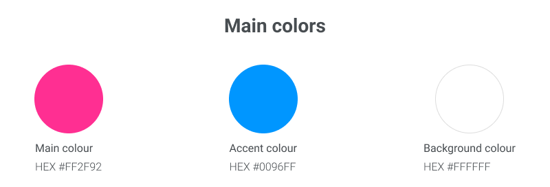
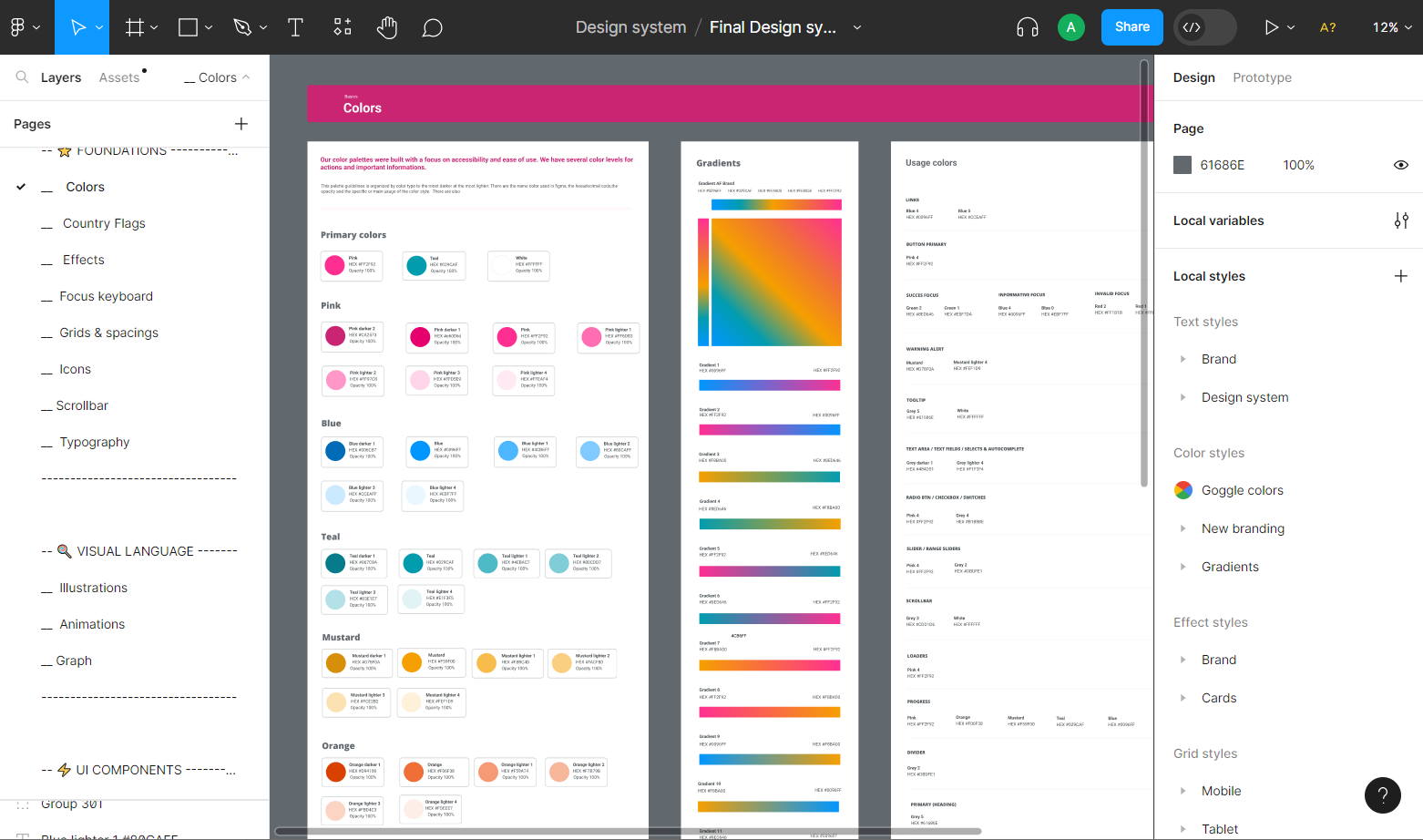
To achieve this, we made the strategic decision to streamline our color palette by defining the main colors as a single primary color, one accent color, and a background color.
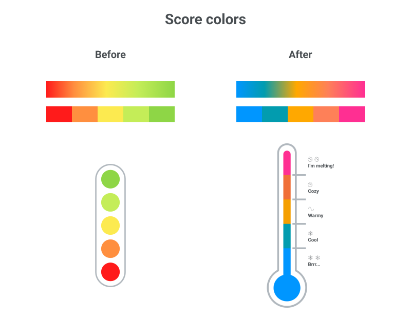
It was essential to retain a supporting palette for score colors and other categories. Up to this point, our scoring color palette had been based on the traffic light system, which created accessibility challenges and negative feedback, particularly regarding the use of the color red. After extensive research, we decided to transition to a palette inspired by the thermometer system. This allowed us to maintain a diverse range of shades within the progression colors, reflecting the dynamic, innovative and fresh attributes of the brand.
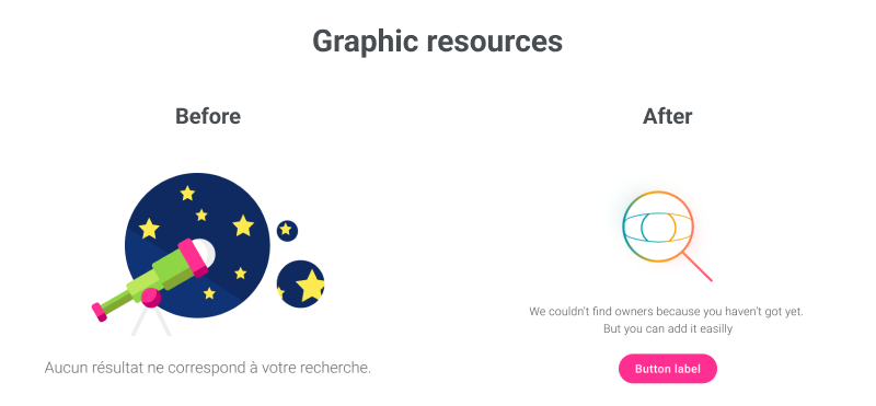
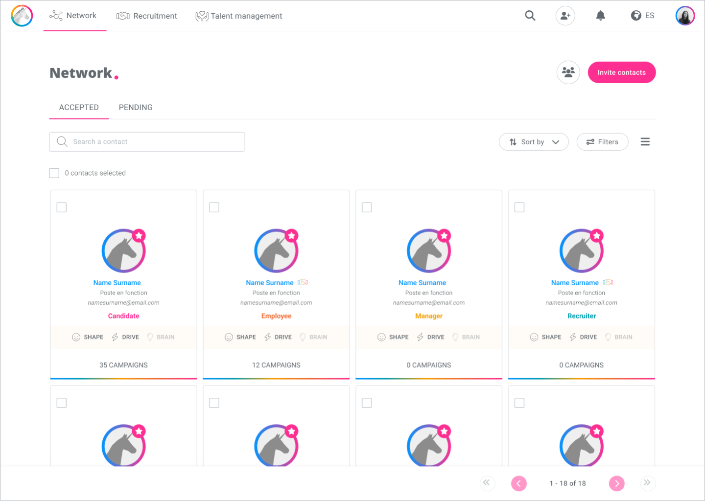
We also reviewed the graphic resources used. At the time, the product used a range of flat-style illustrations, while marketing materials used different photos of people. To shift away from a juvenile aesthetic, we decided to stop using illustrations in the product. Instead, we opted to exclusively use line icons and animations, all in a coherent and unified style.
For marketing materials, we determined that a more professional approach was necessary. This led to the use of authentic, natural photos of people and product mockups.
Technical definition
Once the brand had been updated, we met with the product managers and lead developers to discuss the technical requirements for the design system.
Since our existing programming language was Vue.js, a thorough research led us to a technical decision: to start using the Vuetify framework for the structure of screens and components.
This framework included its own design system that we would need to reuse and adapt to our needs and brand. This framework would also reinforce the consistency of the code across different platforms. However, editing the component attributes introduced certain requirements and limitations that we would have to adjust to.
Design phase
At that point I started working on the design with the rest of the design team. We reviewed the entire application and identified the necessary components and in what context they were used.
It was time to adjust the style of the elements, such as shapes and colors. We also took the opportunity to ensure accessibility of components.
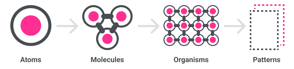
We followed the atomic design approach, starting with the smallest and simplest elements to build with these more complex ones.
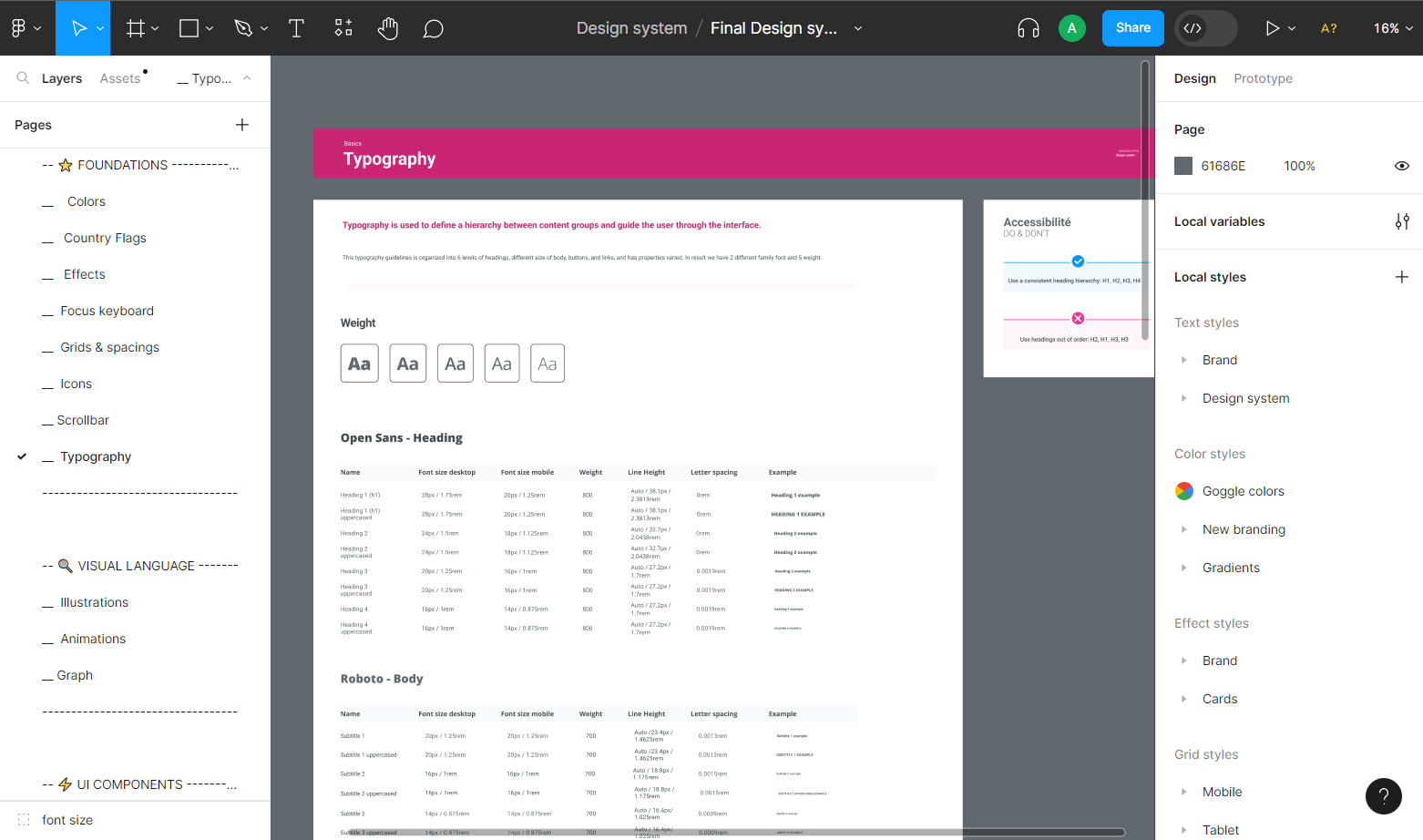
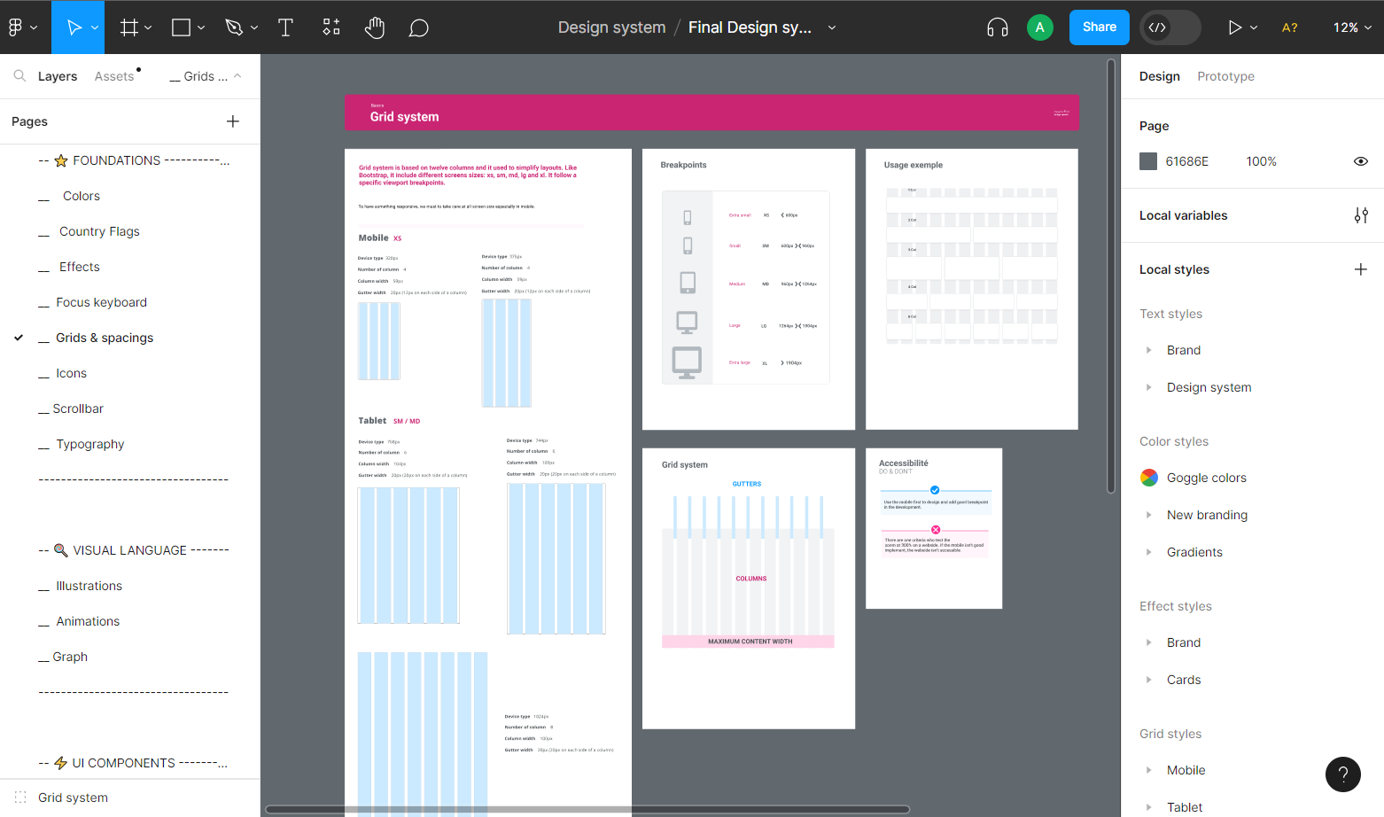
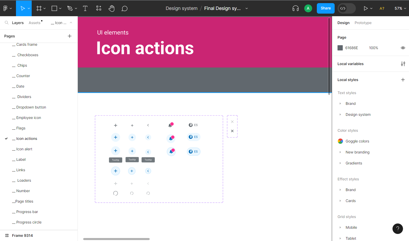
First, we defined the foundations: grids and spacing, colors, typography, elevation, and keyboard controls. These are global attributes that would affect the construction of the components.
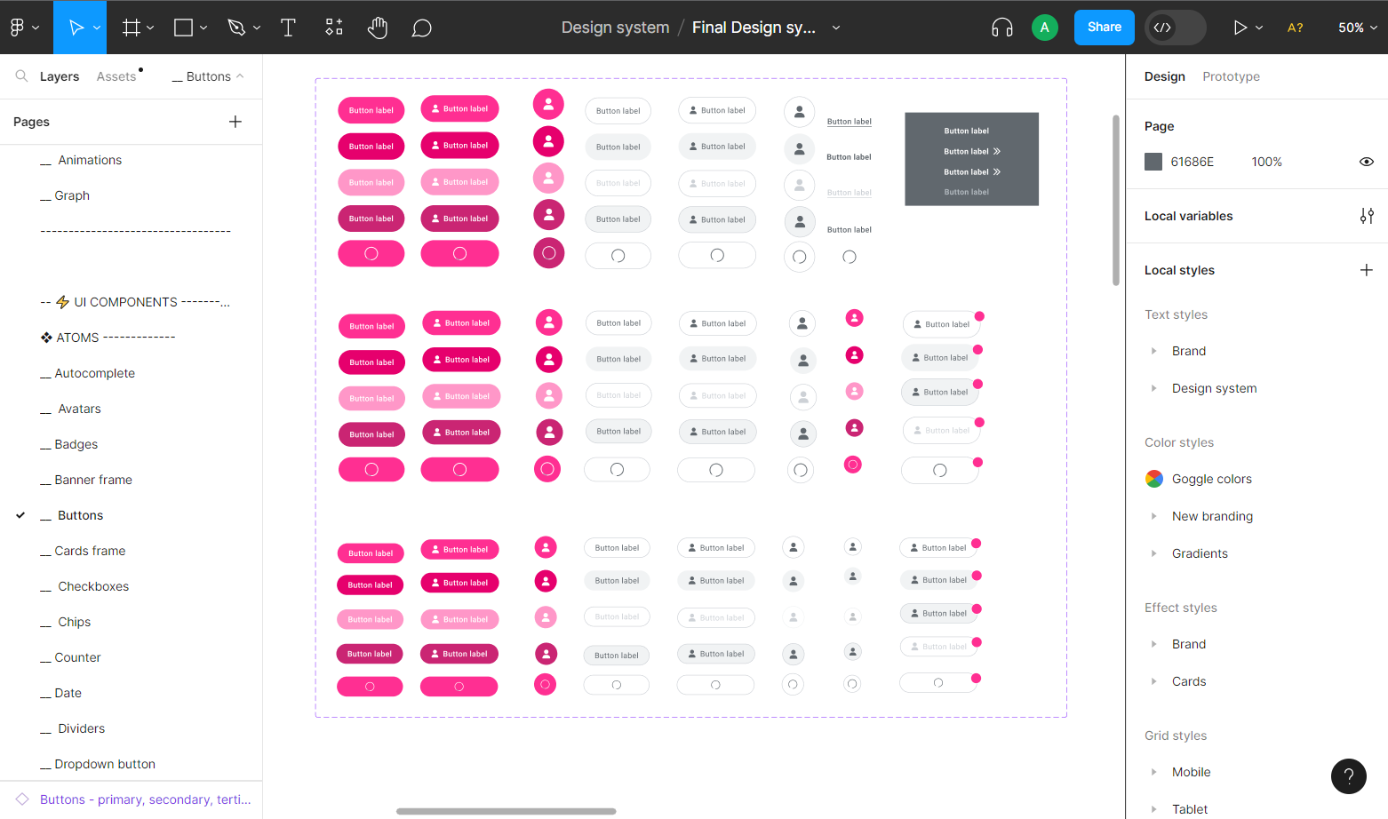
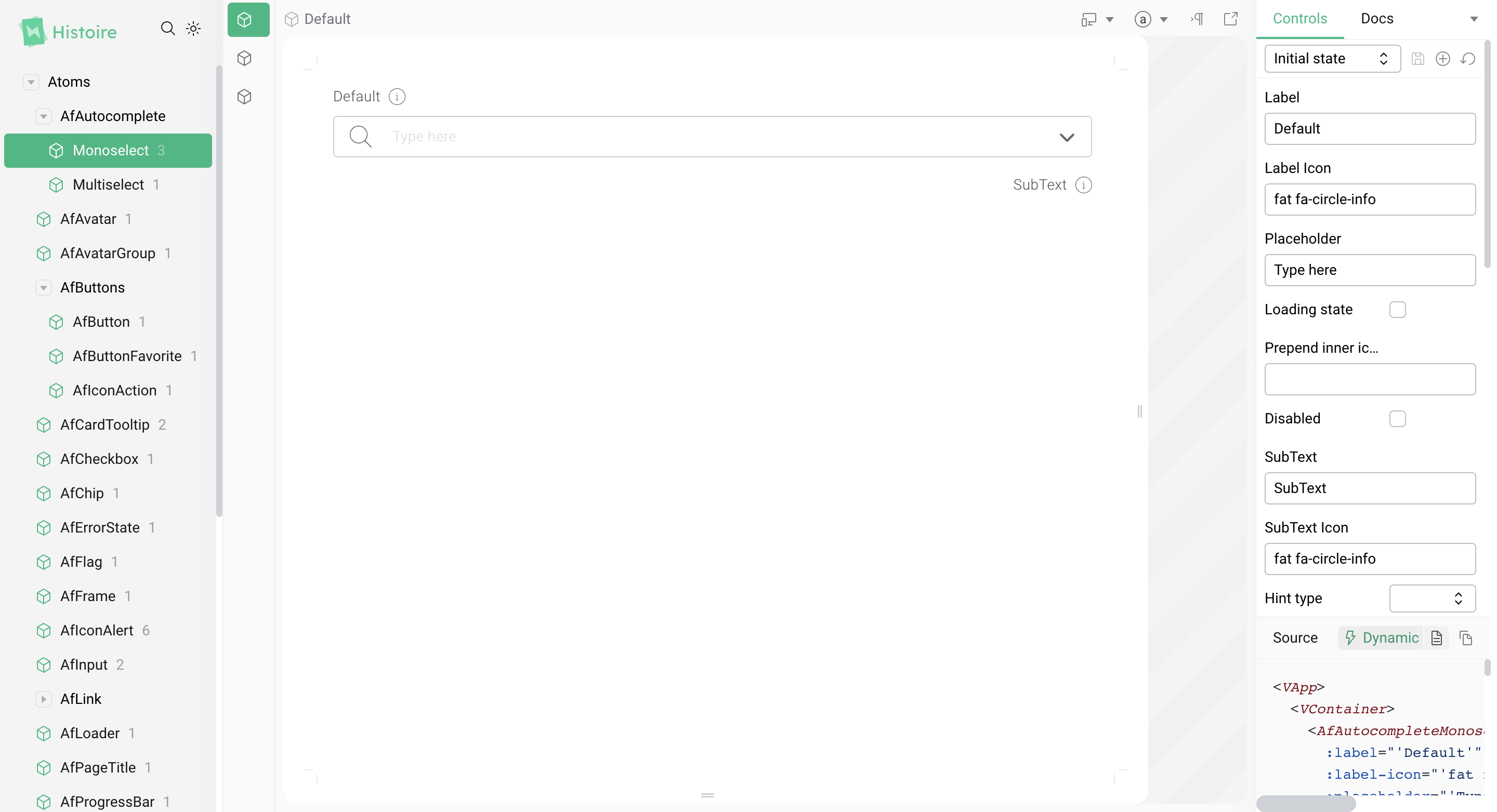
Next, we moved on to the design of atom components, the most basic UI elements.
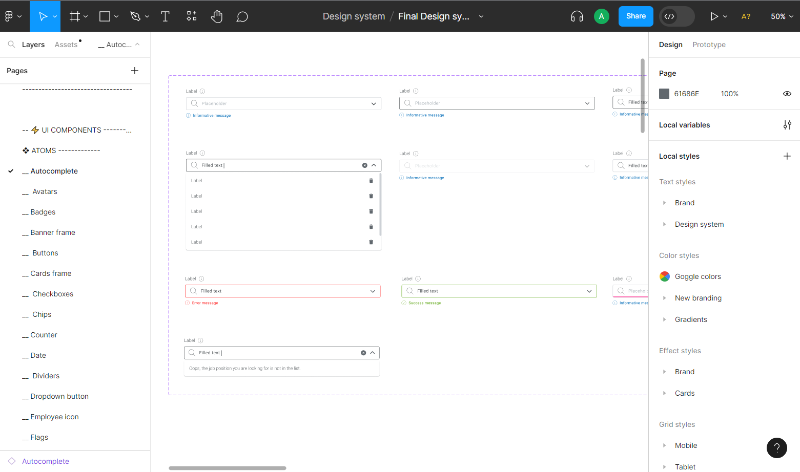
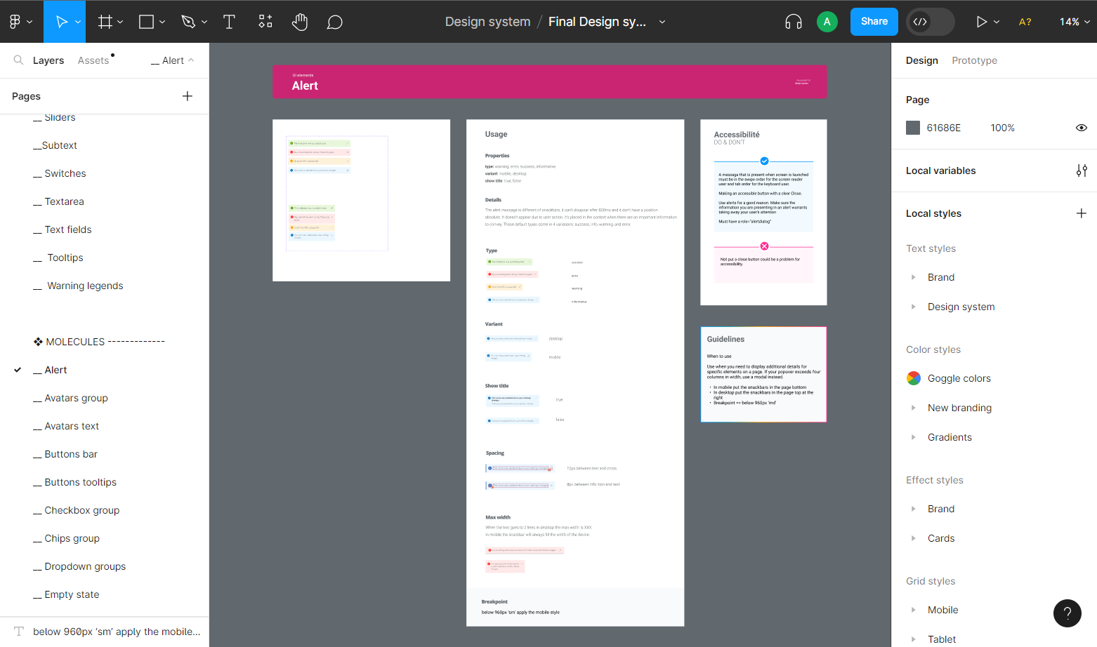
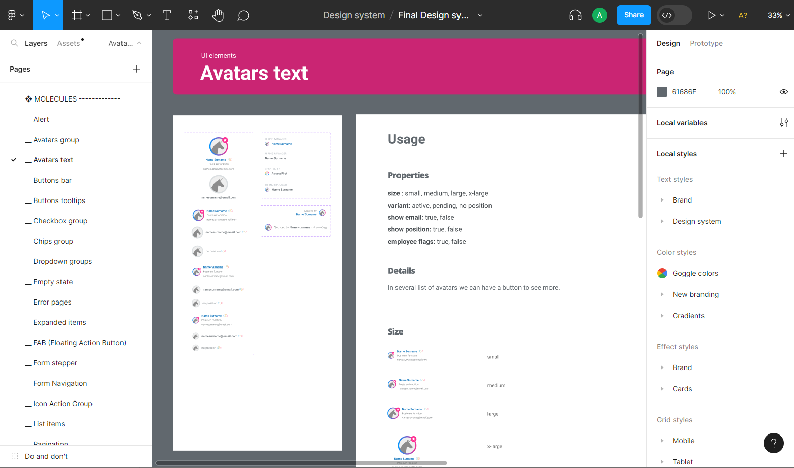
Then we designed the molecules. Molecules are relatively simple groups of atoms functioning together as one.
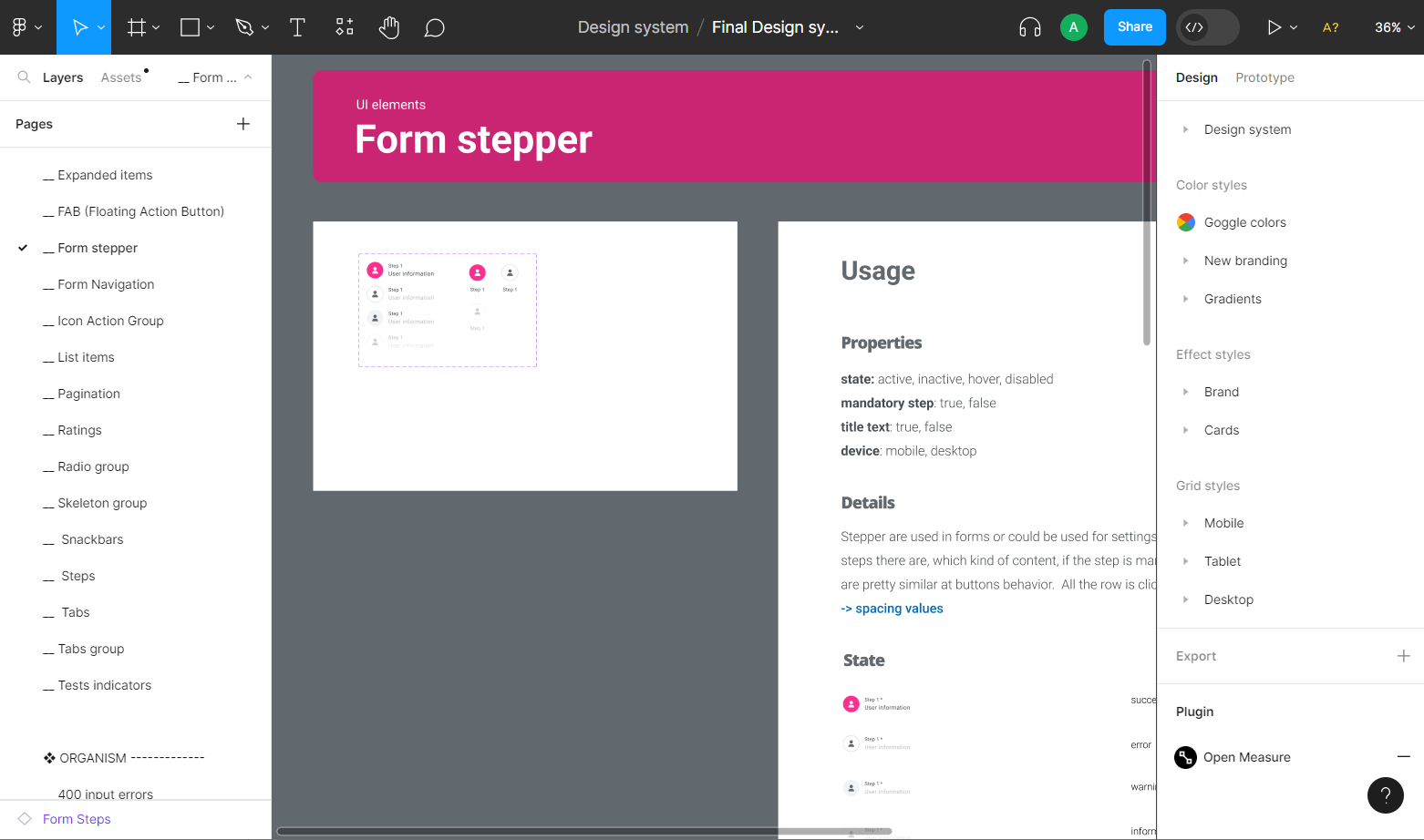
We were then able to define organisms, relatively complex groups of atoms, molecules and other organisms.
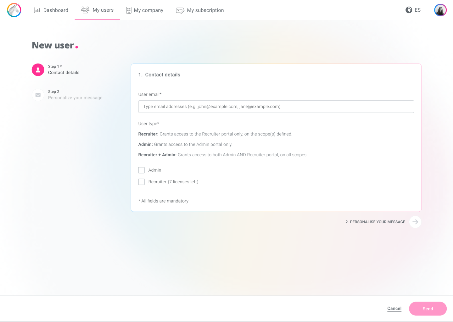
Finally, we set up certain patterns or templates for some of the product screens, such as tables and forms, page-level structures that organize components within the design and define the underlying content structure.
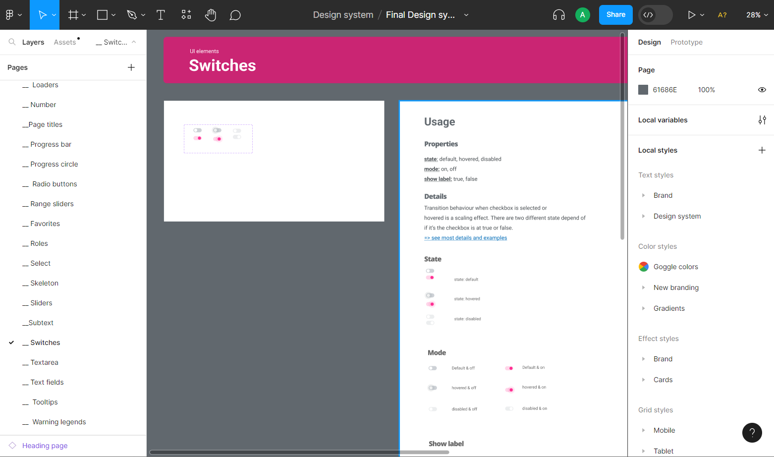
We also created the necessary documentation and guidelines to assist in the development and future maintenance of the design system.
Development phase
During the development phase, which is still in progress, the developers created an environment where they could deploy the components and we could test the styles, behaviors and accessibility. The idea was to be able to test the atoms before the developers began to use these components to develop the molecules, and test the molecules before they developed the organisms.
We also had the opportunity to test the components in context during the testing of the refactoring of some application functionalities, to ensure that they worked as intended.
Project conclusions and maintenance
A design system is a never-ending project, meant to evolve and improve over time. It needs to be solid and consistent but also flexible, so that it can grow. Although the creation of the design system was almost complete, it would continue to grow, so its maintenance is essential.
Looking back, there are areas where we could have done better.. The biggest problem was that the design team was small, and while we were working on the design system, we also had to continue working on other projects. A design system is a large, foundational project for a product, and it would have been better to focus solely on the design system for a few months.
However, I’m pleased with the great job we did, and the benefits were apparent even before the first version was published. Redesigning product functionalities using the design system proved to be quicker and more efficient, and ensured consistency between different functionalities.