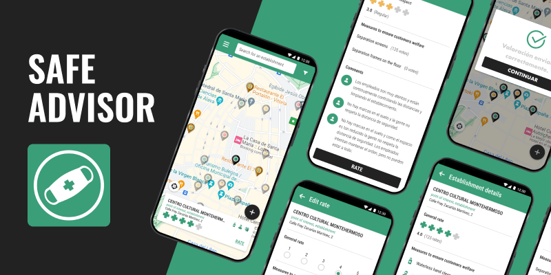
Company: Safe Advisor was developed in collaboration with Konkatena, a startup with which I had already collaborated for other applications.
Team: I worked closely with the full stack developer who was leading the project and with the person in charge of legal and localization, to guarantee the correct implementation of the GDPR and the correct localization in Spanish, English and Basque.
Introduction
In 2020, the COVID-19 pandemic turned our lives upside down. Even when the lockdown was over and we could begin to go out progressively and with many limitations and security measures, people felt insecure and were afraid. Despite everything, society needed to get out again, reconnect with friends and family and get back to their daily jobs and errands.
Konkatena wanted to help in some way, from its possibilities and its vision, and decided to reuse the Peepoo code (an application for searching and rating public bathrooms also developed together a few months before) and adapt it to inform people about the health measures applied by commercial establishments.
Like Peepoo, the content would be created by and for the users, they themselves would rate the establishments, so that other users could consult it later. This would promote citizen participation and thus, the feeling of community. It would also give citizens control over their safety by providing them with information so they could decide which establishments to visit and by allowing them to rate unsafe establishments so that these could improve their sanitary measures.
The process
As this project was based on a recently developed one, we only needed to revisit some phases of the process to adapt the content and brand to the users and the goal of the product.
1. User research : Interviews, creation of User Personas.
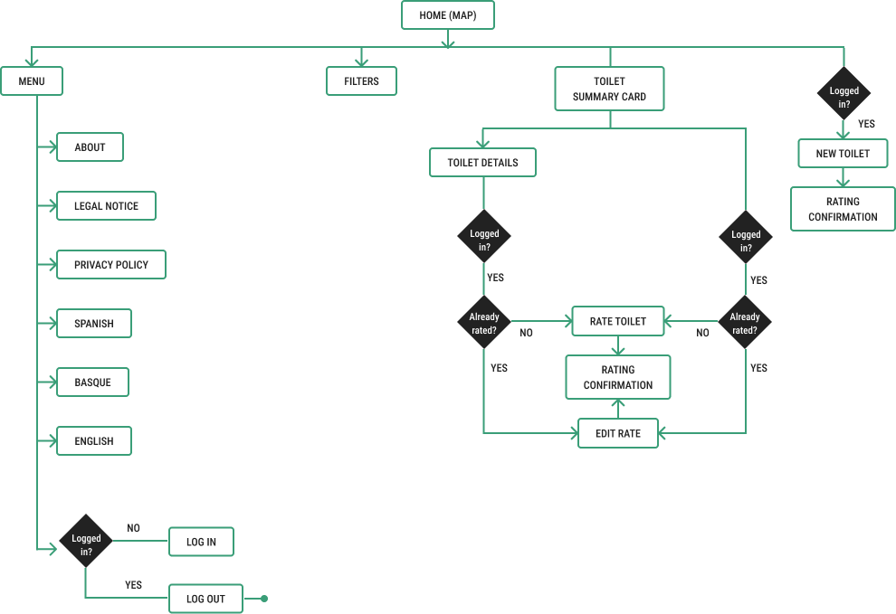
2. Product definition : Definition of the content and the user journey.
3. The brand : Creation of the logo and icon, and definition of the colors and typography.
4. The solution : Design of application screens.
User research
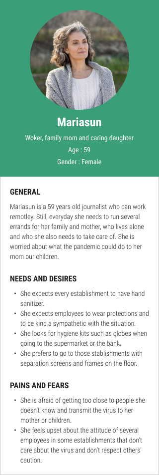
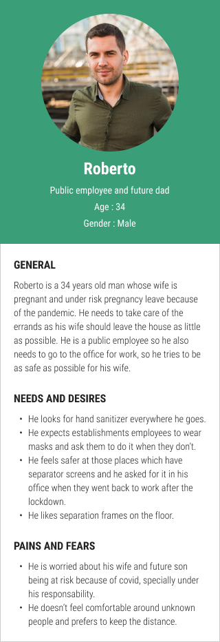
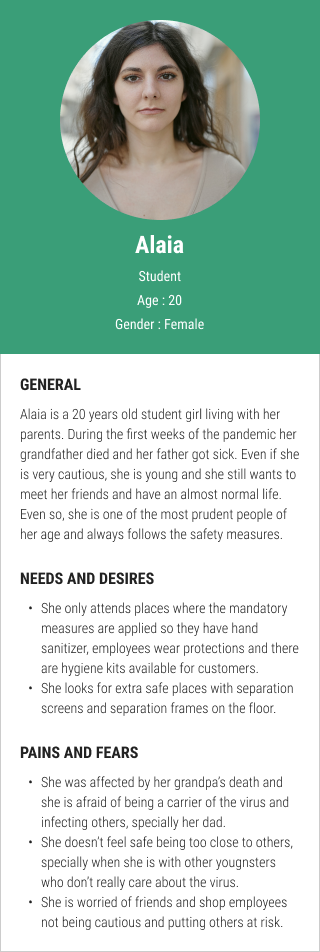
I conducted interviews with close people of different ages and lifestyles, in which I asked them how the pandemic had changed their lives, about their fears, and about personal experiences in different commercial establishments such as supermarkets or bars. Everything they told me helped me build a couple of user personas that would represent the main users of the application.
Product definition
Based on these users’ needs and pains we could define the content.
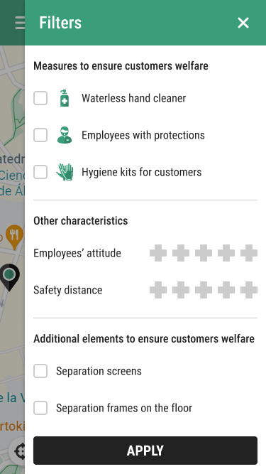
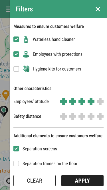
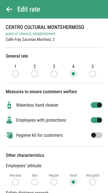
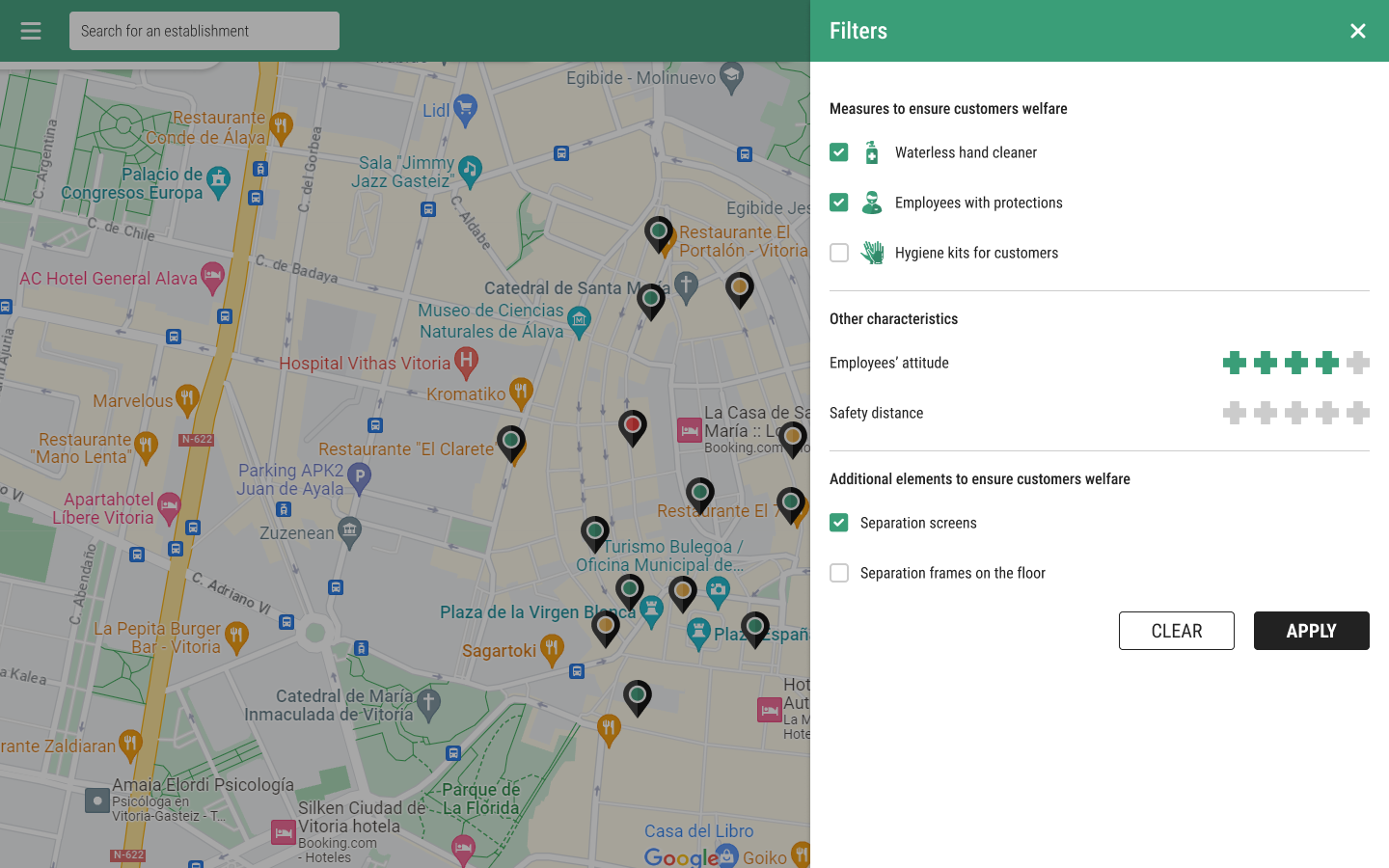
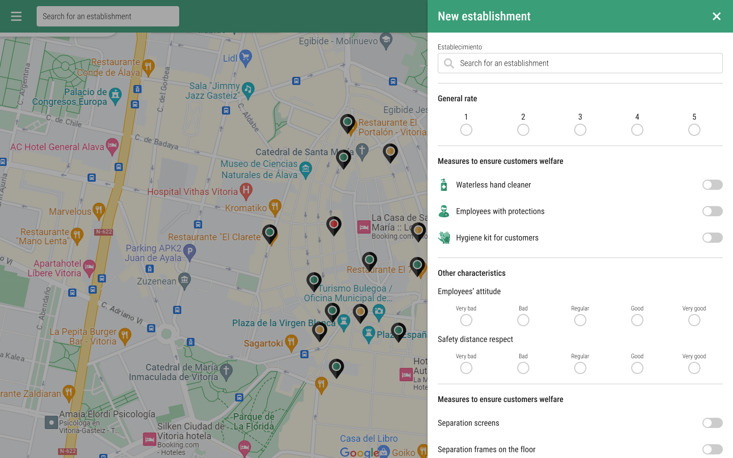
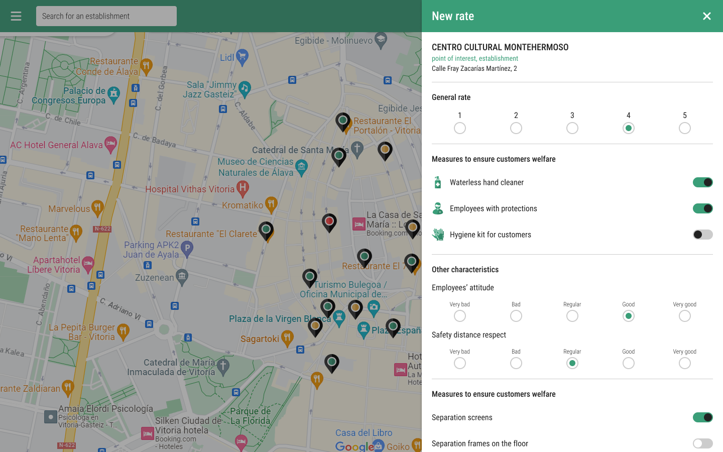
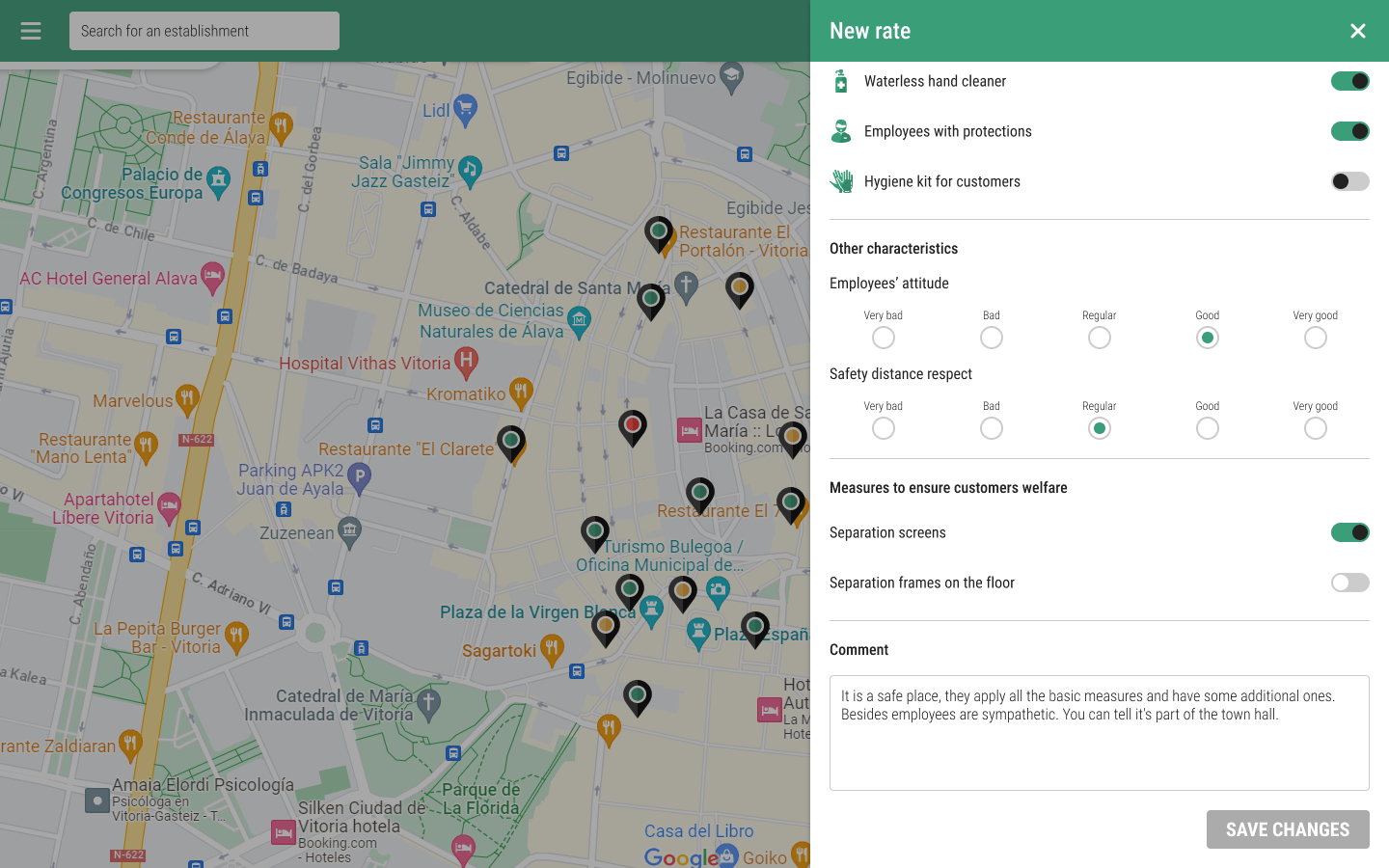
Users considered some measures as basic:
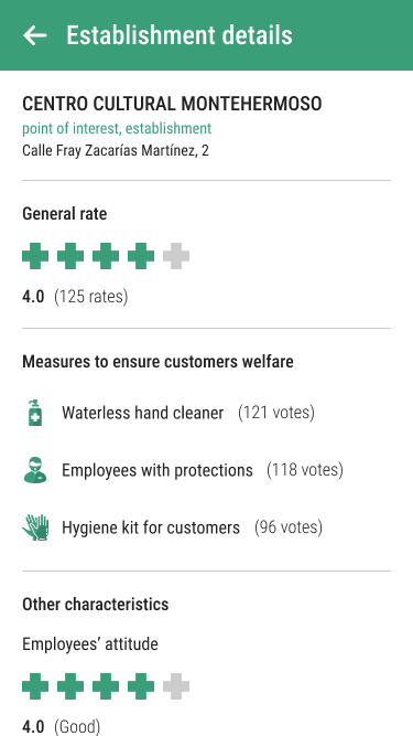
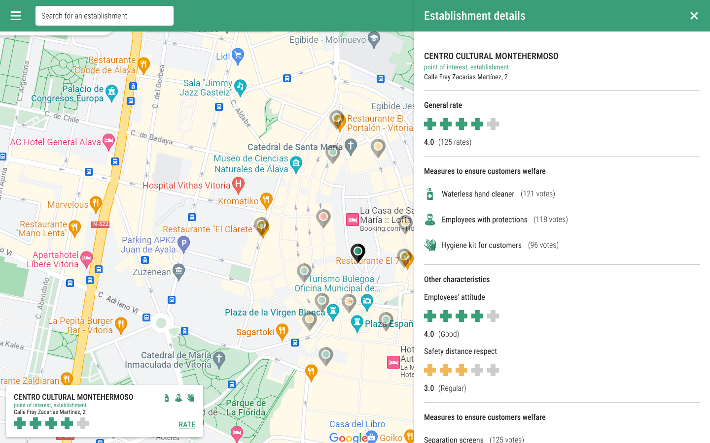
Hand sanitizer
Employees wearing masks and protections
Gloves or others for customers protection
It could be seen that they had fears regarding other characteristics of the establishments:
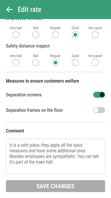
Employees' attitude
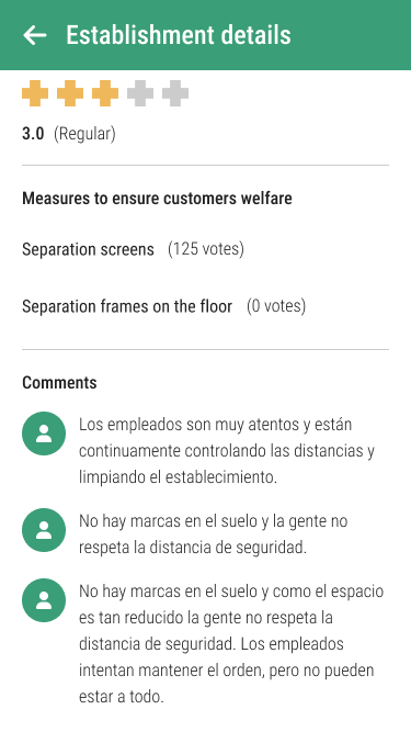
Lack of respect of the safety distance
Users appreciated establishments that applied additional safety measures:
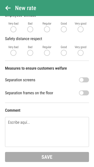
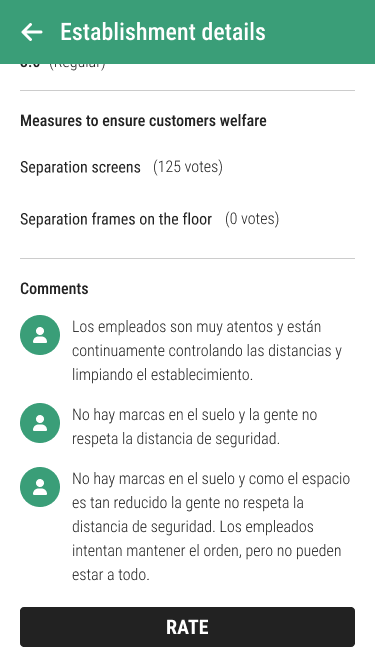
Separation screens
Separation frames on the floor
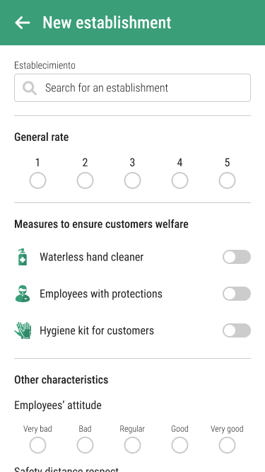
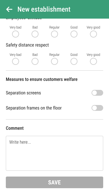
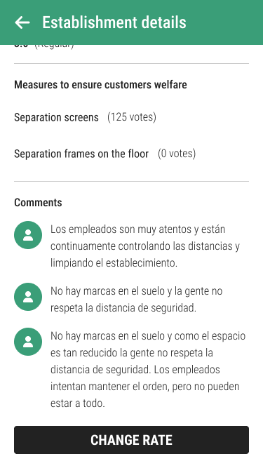
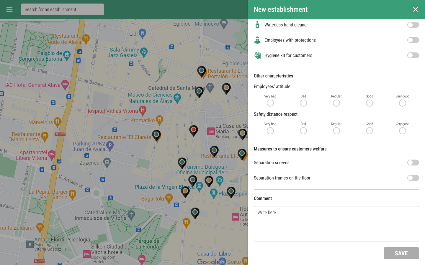
Then, with the developer, we defined the user journey, which would be similar to that of PeePoo. This time, we would include the editing of own ratings, a functionality requested by users during the PeePoo user test.
The brand
When designing the brand I had to consider the situation that was being experienced. The brand needed to represent the seriousness of the problem, but also convey calm and a sense of control and security. It needed to be approachable but professional and trustworthy.
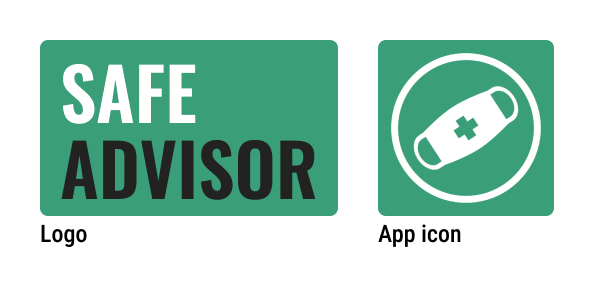
During the brainstorming to find a name for the application, we decided to give a nod to Trip Advisor by putting security at the center of the application, and thus SafeAdvisor was born. For the logo we decided to use only the name, but an icon for the application was still needed. In pursuit of a recognizable icon and therefore easy to find on mobile, I decided to use the icon of a mask, which was already a symbol of the pandemic.
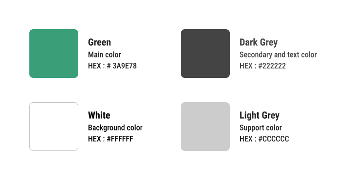
I defined the colors, creating a sober but hopeful and trusting atmosphere:
Green would represent hope.
Dark grey would represent the seriousness and the professionality.
White would represent transparency and reliability.
As support, a light grey would be used.
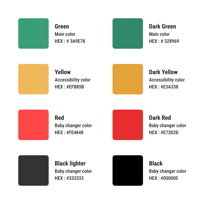
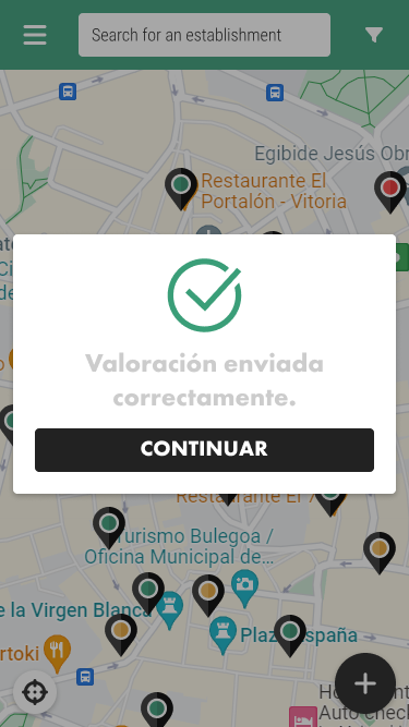
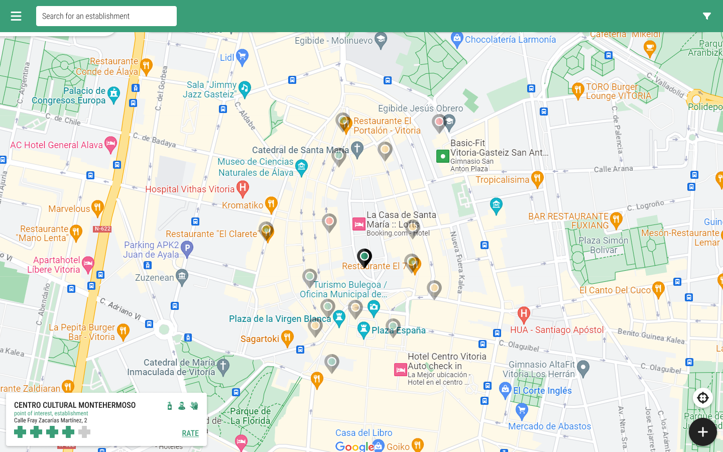
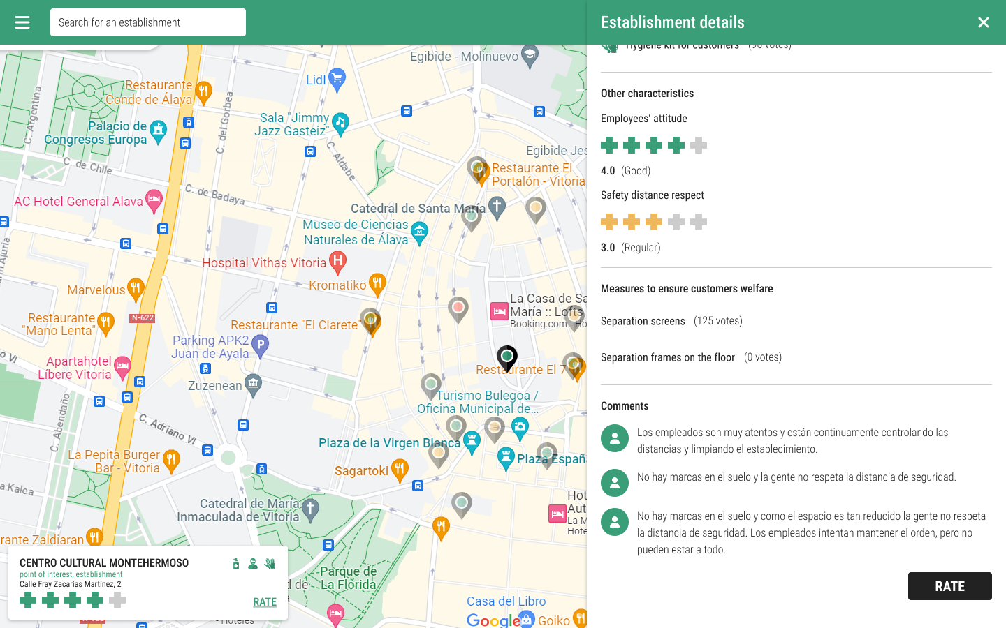
I decided to introduce a traffic light color system to add a visual indicator of ratings. Thus, users could identify dangerous establishments at a glance by identifying the color red.
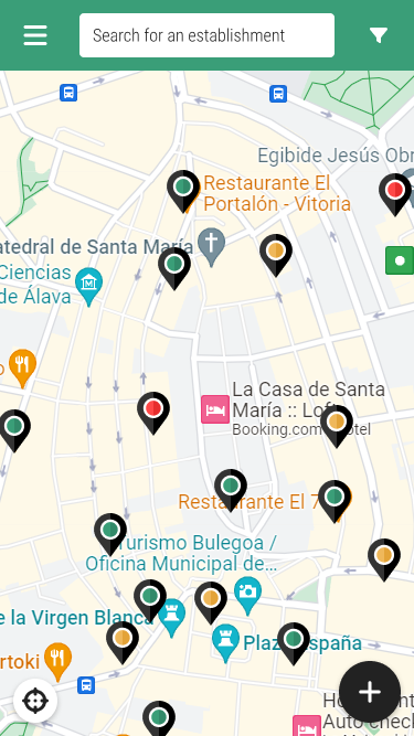
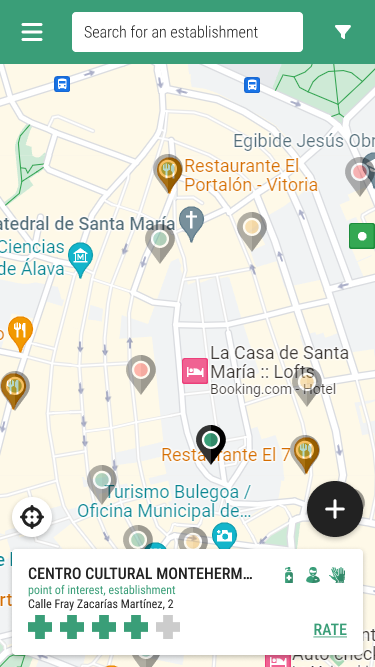
Finally, I created some basic elements for the application such as the map pointers or the ratings. This time I would use traditional shapes for the pointer, but it would include a colored dot to indicate the rating. For the ratings, I decided not to use the classic stars, but crosses, present in pharmacies and related to the medical context.
The solution
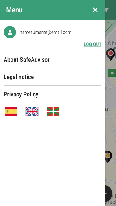
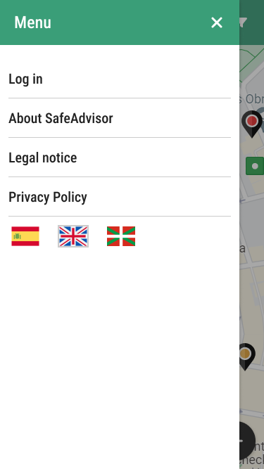
Once the content, user journey and brand were defined, I was able to work on the final screens. Mobile first:
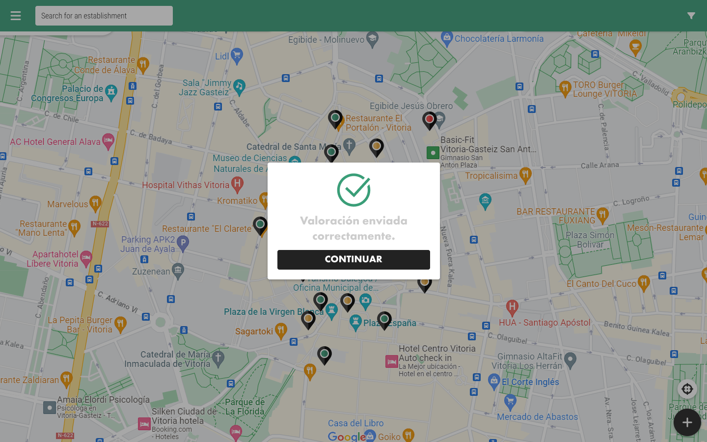
We needed a responsive application, Safe Advisor would be used on the computer much more than PeePoo, since users could consult the ratings before leaving home to decide beforehand. So, I adapted the design for desktop.
Project conclusions
Even if this application reused the logic from another project, as the context and user goals and needs were very different, it was very interesting to conduct user research again. In addition, we had the opportunity to include the functionality of editing your own rating, a great improvement for the user experience.